EARTHQUAKE
FORECASTING PROCEDURES
HOW YOU CAN
PREDICT YOUR OWN EARTHQUAKES
Latest Update:
February 27, 2022
An Internet Browser "Zoom" setting of 120%
to 150%
can make this Web page's text easier to read.
This Earthquake Forecasting
Procedures Web page, the Table-Data Web page, and the Earthquake Forecasting Breakthroughs Web page provide information
regarding procedures that
governments, research groups, and individuals around the world
can use with their efforts:
To forecast earthquakes
And
especially,
To forecast earthquake aftershocks
Earthquake forecasters
around the world should develop an understanding of the Chart data, the Table-Data, and the Electromagnetic
Signal Data (EM
Signals) that are available on the Data.html,
Data-3.html,
Data-4.html,
and Significant
Earthquakes Web pages.
They should then attempt to
identify patterns in the Chart and Table-Data that would enable them to
tell when Significant Earthquakes might be approaching
for locations that are important to them such as where they live
and work.
This present version of this lengthy Web page was prepared a
section at a time over a period of more than a year. One
consequence of that is the fact that some of the Web page sections
can be repetitious. As newer versions of the Web page are
created, that repetition of information inefficiency problem
should be reduced.
Comment: The creation of this present Web page and the Table-Data
Web page involved the expenditure of a tremendous amount of time and
effort. One of the reasons for that, especially with this present
Web page, has been the fact that each time the charts and tables were
studied while the Web pages were being created, more and more things
were learned about the data. As a consequence, during the past
year, both Web pages were
being constantly expanded and modified to take into account all the new
things that were learned. And all of the information on these two
Web pages is just an introduction. There are many more important
things about earthquakes and earthquake triggering processes that can be
learned from these data.
WHAT THIS WEB PAGE DISCUSSES
AND ATTEMPTS TO ACCOMPLISH
As stated above, this Web page
provides information regarding Earthquake Forecasting Procedures that
governments, research groups, and individuals around the world
(including you!) can
attempt to use in order to forecast earthquakes, and
especially, to forecast earthquake aftershocks.
Earthquake forecasters around
the world should develop an understanding of the
Chart data, the
Table-Data,
and the
Electromagnetic Signal Data (
EM
Signals) that are available on the
Data.html,
Data-3,
Data-4,
and
Significant
Earthquakes Web pages.
They should then
attempt to identify patterns in the Chart and Table
Data that
would enable them to tell when Significant Earthquakes
might be approaching for locations that are important to them
such as where they live and work.
A considerably
greater amount of
information regarding various earthquake forecasting topics is
available on the
Earthquake
Forecasting Breakthroughs Web page.
That "
Breakthroughs"
Web page could be thought of as an Internet Web page version of an
"
Encyclopedia
of Earthquake Forecasting." It discusses
conventional earthquake forecasting methods plus unusual ones
involving Earthquake Sensitive humans, animals, plants (
yes, plants!), psychics, and
astrologers, and also
Earthquake
Triggering Processes.
Additional information
regarding
Earthquake Forecasting Procedures will be gradually
added to this present Web page and to other Web pages on this Web
site.
Web page
visitors who are not already familiar with the contents of
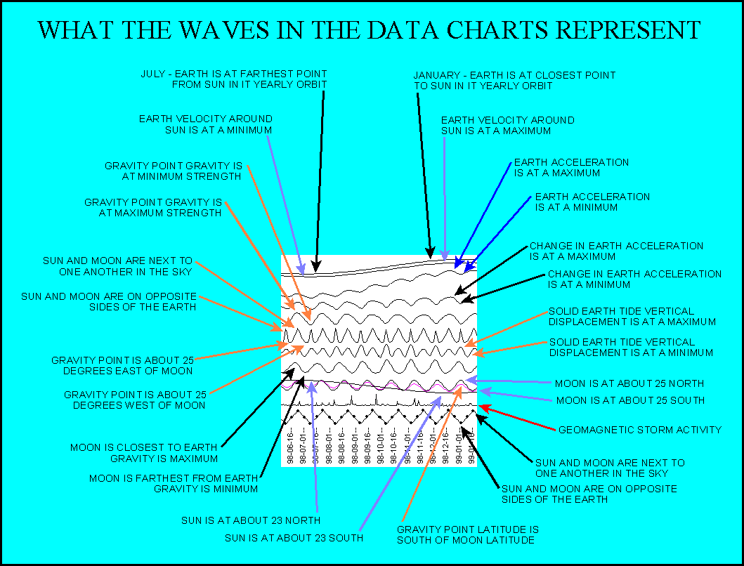
this Web page should review the information in the Comments And Reference Information
Section.
That Comments and Reference
Information section explains the meaning of the circles and lines
on this Web page's charts including
Chart C and the
Year
Chart.
COOKBOOK INSTRUCTIONS FOR
HOW
YOU
CAN PREDICT YOUR OWN EARTHQUAKES
BY USING THE DATA ON THIS
WEB SITE'S WEB PAGES
This present section of this Web page is due for a major update.
` The present most detailed and accurate discussion of "
How You Can Predict Your Own Earthquakes" can be found on the
Chart-Viewers
Web page. That Web page explains in detail with numerious
examples of how people can use some of the downloadable Web pages
available on this Web site to automatically download and use the latest
earthquake forecasting data that are available through this Web site.
This present "
You can
predict your own earthquakes" section of this Web page
provides Web page visitors with additional but older "
Cookbook" type lists of
steps that they can use to try to determine when a significant
earthquake might be approaching for
specific locations such
as a city or the area where a person lives rather than earthquakes
that might be about to occur anywhere on the planet.
Before going into greater
detail regarding this subject matter it is important to explain that because of my schedule limitations and the
tremendous
amounts of time and effort that these efforts require, it is not
possible for me to always keep this Web Site's Web pages updated
with the latest forecast information.
In spite of how much time
and effort might be required,
if the steps being discussed on
this Web page and the
Table-Data
Web page can provide people with the only information available
regarding approaching earthquakes that they could find anywhere,
then, spending the necessary time to use these steps would have
to be worth the effort rather than have people living in some
area be completely unaware that a powerful earthquake could be
approaching.
If just
one
expert researcher in each country where earthquakes are a threat
developed the ability to work
with these types of earthquake forecasting procedures and data
then he or
she might be able to effectively warn other people living in
that country that a significant earthquake could be
approaching. Multiple parties in a given country would not have to
learn how to use these data.
When I checked on this
years ago, information that I found indicted to me that there
were something like 10,000 full-time earthquake researchers in
the People's Republic of China plus a small army of volunteer
workers. And I would expect that with that many people
trying to forecast earthquakes, at least
one of them
could afford to become familiar with the forecasting procedures
being discussed on this Web page.
As discussed in the
A
Procedure For Forecasting Earthquake Aftershock
section of this Web page, in
May
of 2015 I myself used the earthquake aftershock
forecasting procedures discussed on this Web page to determine
that a significant aftershock could be about to occur for the
highly destructive April 25, 2015 Nepal earthquake. And on
May 8, 2015 I sent a formal Nepal earthquake aftershock warning to
Nepal Government officials and to international disaster
mitigation personnel.
The expected earthquake occurred
four days later on May 12, 2015. It was highly destructive.
By itself, that Nepal
aftershock warning demonstrates that these earthquake
forecasting procedures
can be used to generate
invaluable earthquake forecasts!
Once again, as time
permits, these
EM
Signal types of data are being made available on my
Data.html,
Data-2.html,
Data-3.html,
and
Data-4.html
Web pages.
In the past,
Chart
A,
Chart C, and the
Year Chart picture
files on the
Data.html
Web page have usually been kept current. That is possible
because the computer programs that generate them run fairly
automatically. The other charts on that Web page and the
data on the
Data-2.html,
Data-3.html,
and
Data-4.html
Web pages are more difficult to keep current as they
presently require a fair amount of manual data processing.
Cookbook Steps For Predicting Earthquakes
STEP # 1
BECOME FAMILIAR WITH THE
EARTHQUAKE FORECASTING INFORMATION
ON THIS
WEB SITE
Web page visitors who
simply wish to quickly use the information on this Web site to
forecast earthquakes can just examine
Chart C and the
Year
Chart picture files that are available on the
Data.html
Web page. They can skip over the rest of Step # 1 and move on to Steps #s 2 through 4.
People who are more serious
about earthquake forecasting such as government earthquake
forecasters and disaster management personnel should become
familiar with
all of the major Web pages on this
Web site. That would probably require that they spend several
days just reading all that material.
Not everyone would want to
spend so much time on that. However, people who in one way or
another are responsible for determining if an earthquake might be
approaching should do the reading.
The most important Web
pages include the following ones:
Earthquake
Forecasting Breakthroughs Earthquake-Forecasting-Procedures
Table-Data
Significant
Earthquakes
Data
Data-2
Data-3
Data-4
STEP # 2
DETERMINE THE PRIMARY LONGITUDE
LINE FOR YOUR LOCATION OF
INTEREST
The "
Cookbook"
types of steps discussed in this present section of this Web page
pertain largely to the simplest of the
Earthquake Forecasting Procedures that are being discussed on both this Web page and the
Table-Data
Web page. The numerous other forecasting procedures
discussed on those two Web pages can be quite a bit more
complex. And they should be examined individually.
For use with my
charts and this especially simple
Earthquake Forecasting Procedure, in order to predict earthquakes you first need to determine
the
primary longitude line that is of interest to you.
For example, if you live along the 120 W longitude line and are watching for
approaching earthquakes at that longitude then 120
W would be your primary significant longitude line.
STEP # 3
EXAMINE CHART C AND THE YEAR CHART
ON THE DATA.HTML WEB PAGE
If there are strong, recent, persistent line peaks on
Chart C or
the
Year Chart at the longitude of interest to you then it is possible
that an earthquake could be approaching for that longitude.
"
Persistent" line peaks would be ones that remain at a given longitude
for more than a few weeks.
When that happens, people
should attempt to determine if there are other easily observable
earthquake precursors that are being detected somewhere along that
longitude line. If precursors like that are being detected then that
could provide additional confirmation information that an earthquake is
approaching for some location along the longitude line.
Additional efforts should then be
made to determine if an earthquake could be approaching. If all of
the data indicate that one is approaching then appropriate steps should
be taken to get people prepared for it.
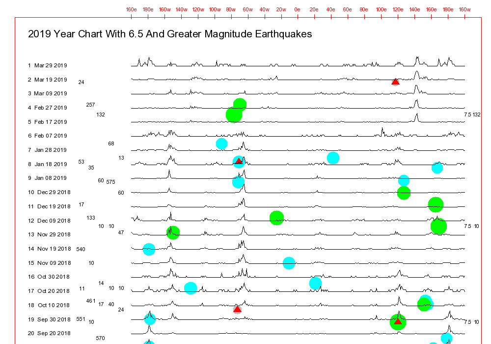
The
Year Charts picture file contains
Chart C
and the
Year Chart
types of information going back to the start of 2001. If that
picture file is examined it will be seen that an earthquake will occur
where there are line peaks only some of the time. Most often the
line peaks will be pointing to the buildup of strain in some fault zone
at a different longitude.
However, on some occasions the line
peaks longitudes will be quite accurate. And an earthquake will occur in a
fault zone along the longitude line where the line peaks are seen on
Chart C and the
Year Chart.
That information combined with the
fact that the procedure being discussed here is such a simple and
easy-to-use test for approaching earthquakes are good indicators that
people should be using this approach to watch for an earthquake in spite
of any limitations that might be associated with the procedure.
STEP # 4
CALCULATE VALUES FOR ALL FOUR
OF THE SIGNIFICANT
LONGITUDES FOR YOUR LOCATION
OF INTEREST
These calculations are
important because my chart generation computer programs regard
longitudes that are 90, 180, and 270 degrees to the east and to
the west of one another as being about the same as one another when it does its calculations. So, when the
various charts are examined,
all four longitudes need to be
checked.
If you live at 120 W
longitude for example, then the four significant longitudes for
you would be: 120 W, 30 W, 60 E, and 150 E.
120 W = 120 W
30 W = 120 W - 90
60 E = 120 W -180
150 E = 120 W - 270 or 120 W + 90
After doing those simple calculations, repeat Step # 3 for all four of
those longitudes - Check fault zones along each longitude line to
see if other earthquake precursors are being detected along any of them. It
is believed that it is likely that the precursors might be detected
along
one of the longitude
lines. Most often they will probably not be detected at that same
time along the other three longitude lines.
STEP # 5
BECOME FAMILIAR WITH THE
LOCATIONS OF THE
LONGITUDE LINE PEAKS ON THE DATA.HTML
WEB PAGE
CHARTS FOR SIGNIFICANT PAST EARTHQUAKES THAT
OCCURRED AT LOCATIONS THAT
ARE IMPORTANT TO YOU
Step # 5 is for earthquake
forecasters who are willing to invest a fair amount of time and effort
into telling
when and
where Significant Earthquakes might be about to occur.
This procedure involves comparing data line peaks on
Chart C and the
Year Chart with line peaks for past
Significant Earthquakes.
Two charts on the
Data.html
Web page display line peaks for
Significant Earthquakes
going back to the start of 1973. The earthquakes are
displayed on the Web page sorted both by
Earthquake Occurrence Date And Time and by
Earthquake
Longitude.
Those are the best charts
to study if you wish to examine a number of significant
earthquakes that occurred in the past in your area. The
Significant
Earthquakes Web page displays a considerable amount
of additional information regarding each of those earthquakes including those
Date and
Longitude Sort charts..
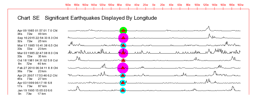
To provide an example of one of those charts, the chart below is a small
part of an earlier version of the
Significant Earthquakes Longitude Sort Chart.
It shows the line shapes for a number of past significant
earthquakes that occurred in the 72 W to 73 W area.
As can be seen on the above chart, earthquakes occurring at roughly the
same latitude and longitude as one another can have dramatically different line
shapes!
The following explanation
information for charts such as the one above is discussed in more detail in other sections of
this Web page and other Web pages on this Web site.
Chart Data Explanation For The Data.html
Web Page Charts
--- The colored circles or dots on the chart show the longitude of the earthquake and its magnitude.
--- A red triangle within one of those circles shows
that there were one or more fatalities associated with the earthquake.
--- A line peak at some longitude indicates that my
computer programs determined that the earthquake or the EM
Signal associated with that line had triggering
characteristics that caused it to look like earthquakes that
occurred in the past at the longitude of the line peak, or at 90,
180, or 270 degrees to the east or west of the line peak.
As stated, serious
earthquake forecasters should compare the line peak shapes of the
latest
Chart C and
Year Chart data lines with the line peak shapes for
past
Significant Earthquakes as displayed on those
Significant Earthquake charts.
When the
Chart C or
Year Chart data lines were good line shape matches with the data line for some past
Significant Earthquake then the earthquake forecasters would start watching for earthquake precursors near the location of that past
Significant Earthquake.
Step # 5 would involve enough time and effort that it would
probably only be possible for people who were watching for earthquakes
that could be approaching for specific locations. It would be
difficult for one person or even small groups of earthquake forecasters
to use
Step # 5 to watch for earthquakes that were approaching for
all of the fault zones that exist around the world. An automated computer program could do that quickly and easily.
SEVERAL, SIMPLE,
INTRODUCTORY EXAMPLES OF THE
EARTHQUAKE FORECASTING PROCEDURES
THAT ARE BEING DISCUSSED ON
THIS
PRESENT WEB PAGE AND ON
THE TABLE-DATA
WEB PAGE
The chart below is an especially simple example of
one of the Earthquake Forecasting Procedures that are being
discussed on this Web page. This example has been included here to
provide earthquake researchers with a general idea regarding the
types of information that can be found on this Web page.
This chart is discussed in more
detail in other sections of this Web page including one that
involves comparing Averaged EM Signal
Line Peak Longitudes with
Individual Earthquake Longitudes.
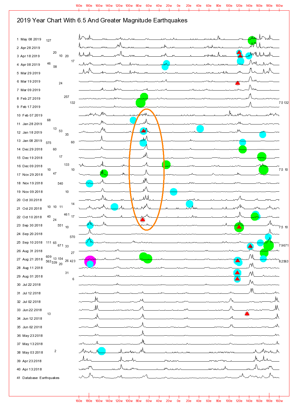
The chart is the version of the
Data.html
Web Page's Year Chart that was generated on May 8,
2019. The chart area circled in orange and the deadly January
20, 2019 Chile area earthquake are the focus of this discussion.
As explained in the Additional Comments and Information
section, each horizontal data line on the above chart represents an
average of all of the EM
Signals that were detected during a 90-day period of time.
Each of those time periods ended on the date shown on the left side
of the chart. Each of those Averaged EM Signal lines on
the chart is offset from one above it and the one below it by 10
days.
The longitude of a line peak on any
of the chart lines indicates that the computer program used to
generate the chart determined that the Averaged EM Signals
for that line resembled earthquakes that occurred in the past at the
longitude of the line peak.
In some cases that
could be an indicator that an earthquake is approaching for a
fault zone located somewhere along that longitude line.
For a variety of reasons, there
can be line peaks at more than one longitude on a given line.
One reason for that is that several approaching earthquakes could be
generating strong EM Signals at the same time. Another reason
that is explained with the next chart shown below is that the
computer program that generates these charts will at times draw line
peaks for the same approaching earthquake at multiple locations on a
given line.
ANALYSIS
OF THE ABOVE CHART'S LINE PEAKS
It can be seen by the area on
the chart that is circled in orange that there were strong line
peaks at about 71 W (actuallly closer to 65 W) beginning around
October 12, 2018, and continuing on until about February 9, 2019.
A variety of data provide
evidence that those line peaks were indicating that the following
6.7 magnitude January 20, 2019 Chile area earthquake was
approaching. The earthquake reportedly resulted in several
fatalities.
2019/01/20 01:32:51 30.07S 71.42W 53 6.7 "15km SSW
of Coquimbo, Chile"
After remaining in the 71 W
area for almost four months, the line peaks made an abrupt
transition to another longitude within two weeks after the
earthquake occurred. That might indicate that after the
earthquake occurred, few or no new high intensity EM Signals
pointing directly to 71 W were being generated.
Quite a few of the Individual EM Signals detected
around that time were undoubtedly associated with that approaching
deadly Chile area earthquake.
TABLE DATA FOR THE
JANUARY 20, 2019 CHILE AREA EARTHQUAKE
The Table Data associated with various charts can be
quite complex.
They can be found on the Data-3,
the Data-4,
and the Significant
Earthquakes Web pages. They are discussed in
detail on the Table-Data
Web page.
The second, simple example of
an earthquake forecasting procedure being discussed on this Web page
pertains to the Table Data associated with Line # 13 on the
above Year Chart. This example is being presented here
to show what the Table Data data look like. Longitudes
around 71 W are of special interest. They have been
highlighted with bold text.
 Table 1                                     Table 2                                                Table 3                                                Table 4                                                Table 5                                                Table 6                                                Table 7                                                Table 8                                                Table 9

 Line # 13  Line Date 2019/01/08             Line #       13                                        Line #       13                                        Line #       13                                        Line #       13                                        Line #       13                                        Line #       13                                        Line #       13                                        Line #       13
 Table Longitudes                            Line Date    2019/01/08                                Line Date    2019/01/08                                Line Date    2019/01/08                                Line Date    2019/01/08                                Line Date    2019/01/08                                Line Date    2019/01/08                                Line Date    2019/01/08                                Line Date    2019/01/08
                                                          Destructive Matches - Quality Sort                     Destructive Matches - Longitude Sort                   8.0+ Mag - Longitude Sort                              7.5+ Mag - Longitude Sort                              7.0+ Mag - Longitude Sort                              6.5+ Mag - Longitude Sort                              6.0+ Mag - Longitude Sort                              5.0+ Mag - Longitude Sort
 Qual  Lon 8.0+ 7.5+ 7.0+ 6.5+ 6.0+ 5.0+
                                              Pa  Pd  D#  Earthquake UTC Date Lat Lon Depth Mag      Pa  Pd  D#  Earthquake UTC Date Lat Lon Depth Mag      Pa  Pd  D#  Earthquake UTC Date Lat Lon Depth Mag      Pa  Pd  D#  Earthquake UTC Date Lat Lon Depth Mag      Pa  Pd  D#  Earthquake UTC Date Lat Lon Depth Mag      Pa  Pd  D#  Earthquake UTC Date Lat Lon Depth Mag      Pa  Pd  D#  Earthquake UTC Date Lat Lon Depth Mag      Pa  Pd  D#  Earthquake UTC Date Lat Lon Depth Mag
  71W 124E 165E 162E 170E 169E 166E 117E      98 100   1  1997/11/06 02:34:33 47N  71W   23 4.8      95  97   2  2000/05/04 04:21:16  1S 124E   26 7.6      84  86   2  2013/02/06 01:12:25 11S 165E   24 8.0      89          2014/04/12 20:14:39 11S 162E   29 7.6      92          1986/01/15 20:17:31 21S 170E  140 7.1      94          1994/02/12 17:58:23 21S 169E   27 7.2      96          1992/04/05 11:46:35 12S 166E   48 6.4      98          1979/06/02 09:48:00 31S 117E    6 6.0
  70W 121E 161E 161E 169E 166E 121E 117E      97  99   1  1998/01/30 12:16:08 24S  70W   42 7.1      92  94   2  1994/11/14 19:15:30 14N 121E   32 7.1      86          2004/12/23 14:59:04 49S 161E   10 8.1      88          2016/12/08 17:38:46 11S 161E   41 7.8      94          1994/02/12 17:58:23 21S 169E   27 7.2      95          1985/12/16 08:04:10 14S 166E   52 6.5      96  98   1  1988/06/19 20:19:52 12N 121E   17 6.2      98          1979/06/02 09:47:58 31S 117E    3 6.1
  30E 121E 153E 125E 167E 166E 117E 116E      97  99   3  1995/10/01 15:57:16 38N  30E   33 6.4      96  98   1  1988/06/19 20:19:52 12N 121E   17 6.2      71          2013/05/24 05:44:49 55N 153E  608 8.3      89  91   2  2004/11/11 21:26:41  8S 125E   10 7.5      92          2015/10/20 21:52:02 15S 167E  127 7.1      95          1985/12/16 08:03:14 14S 166E   54 6.5      98          1979/06/02 09:48:00 31S 117E    6 6.0      98          1983/02/26 16:00:14 11S 116E   33 5.0
 121E 121E 153E 124E 161E 124E 117E 114E      96  98   1  1988/06/19 20:19:52 12N 121E   17 6.2      94  96   1  1985/04/24 01:07:14 16N 121E   33 6.1      71          2013/05/24 05:44:48 55N 153E  598 8.3      95  97   2  2000/05/04 04:21:16  1S 124E   26 7.6      92          1977/04/20 23:49:12 10S 161E   16 7.1      95  97   2  2000/05/04 04:21:16  1S 124E   26 7.6      98          1979/06/02 09:47:58 31S 117E    3 6.1      98          1994/06/09 16:37:46 10S 114E   33 5.8
  27E 117E 150E 123E 125E 123E  30E 114E      95  98   1  1999/04/22 22:19:36 28S  27E    5 5.7      95  97   1  2019/03/17 07:07:27  8S 117E   24 5.5      73          1998/03/25 03:12:25 63S 150E   10 8.8      94          1996/06/17 11:22:18  7S 123E  587 7.9      92          1988/02/24 03:52:06 13N 125E   40 7.3      94          1996/06/17 11:22:18  7S 123E  587 7.9      97  99   3  1995/10/01 15:57:16 38N  30E   33 6.4      98          1978/01/14 14:55:52 11S 114E   42 5.4
  71W  99E 150E 101E 124E 120E  22E 110E      95  97   1  2014/04/01 23:46:47 20S  71W   25 8.2      94  96   1  1995/07/11 21:46:39 22N  99E   13 6.8      73          1998/03/25 03:12:25 63S 150E   10 8.1      88          2007/09/12 23:49:04  3S 101E   30 7.9      95  97   2  2000/05/04 04:21:16  1S 124E   26 7.6      96          2018/08/17 15:35:02  7S 120E  539 6.5      99          2008/02/14 10:09:22 37N  22E   29 6.9      98          1986/06/14 15:33:56  6S 110E  563 5.7
 124E  34E 101E 101E 123E  22E  20E  26E      95  97   2  2000/05/04 04:21:16  1S 124E   26 7.6      93  95   1  2002/05/18 15:15:08  3S  34E   10 5.5      89  91   2  2007/09/12 11:10:26  4S 101E   34 8.4      89  91   2  2007/09/12 11:10:26  4S 101E   34 8.4      94          1996/06/17 11:22:18  7S 123E  587 7.9      99          2008/02/14 10:09:22 37N  22E   29 6.9      96          1983/01/17 12:41:30 38N  20E    6 6.9      98          2001/05/24 17:34:01 46N  26E  141 5.3
 117E  30E  97E  70E 122E  20E  63W  23E      95  97   1  2019/03/17 07:07:27  8S 117E   24 5.5      97  99   3  1995/10/01 15:57:16 38N  30E   33 6.4      73          2000/06/18 14:44:13 14S  97E   10 8.0      89  91   3  2015/10/26 09:09:42 37N  70E  231 7.5      92          1984/08/06 12:01:53  0N 122E  244 7.4      96          1983/01/17 12:41:30 38N  20E    6 6.9      97          2011/09/02 13:47:11 28S  63W   93 6.7      98          2018/01/02 04:24:17 41N  23E    6 5.1
  23E  27E  93E  68W 121E  10W  66W  23E      94  96   1  1981/03/07 11:34:44 38N  23E   33 5.5      95  98   1  1999/04/22 22:19:36 28S  27E    5 5.7      74  75   1  2012/04/11 08:38:36  2N  93E   20 8.6      88  90   1  1994/06/09 00:33:16 14S  68W  631 8.2      92  94   2  1994/11/14 19:15:30 14N 121E   32 7.1      95          1975/04/16 01:27:19 71N  10W    7 6.5      98          2010/01/17 12:00:02 58S  66W   10 6.3      98          2012/09/21 08:47:40 35N  23E   16 5.0
 121E  23E  92E  69W  68W  63W  66W  23E      94  96   1  1985/04/24 01:07:14 16N 121E   33 6.1      94  96   1  1981/03/07 11:34:44 38N  23E   33 5.5      74          2012/04/11 10:43:10  1N  92E   25 8.2      86  88   2  2005/06/13 22:44:33 20S  69W  116 7.8      94          1974/01/02 10:42:33 22S  68W  121 7.1      97          2011/09/02 13:47:11 28S  63W   93 6.7      97          2007/07/21 15:34:52 22S  66W  290 6.4      98          2009/05/24 16:17:50 41N  23E    1 5.3
  99E  22E  92E  70W  70W  70W  70W  23E      94  96   1  1995/07/11 21:46:39 22N  99E   13 6.8      93  95   1  1990/12/21 06:57:42 41N  22E   13 6.1      74          2012/04/11 10:43:10  1N  92E   25 8.2      86          2014/04/03 02:43:17 20S  70W   40 7.6      97  99   1  1998/01/30 12:16:08 24S  70W   42 7.1      97  99   1  1998/01/30 12:16:08 24S  70W   42 7.1      97          2018/01/21 01:06:42 19S  70W  111 6.3      99          1986/10/05 05:12:15 35N  23E   15 5.0
  70W  21E  68W  71W  70W  71W  70W  22E      93  95   1  1987/08/08 15:48:56 19S  70W   70 7.2      93  95   1  1991/07/12 10:42:21 45N  21E   11 5.6      88  90   1  1994/06/09 00:33:16 14S  68W  631 8.2      95  97   1  2014/04/01 23:46:47 20S  71W   25 8.2      93  95   1  1987/08/08 15:48:56 19S  70W   70 7.2      95  97   1  2014/04/01 23:46:47 20S  71W   25 8.2      98          2014/04/01 23:58:00 19S  70W   18 6.2      99          2008/02/14 10:09:22 37N  22E   29 6.9
  22E  14E  71W  74W  71W  71W  70W  61W      93  95   1  1990/12/21 06:57:42 41N  22E   13 6.1      92  94   1  1998/04/12 10:55:32 46N  14E   10 5.6      95  97   1  2014/04/01 23:46:47 20S  71W   25 8.2      86          2016/12/25 14:22:27 43S  74W   38 7.6      95  97   1  2014/04/01 23:46:47 20S  71W   25 8.2      95          1998/01/12 10:14:07 31S  71W   34 6.6      97  99   1  1998/01/30 12:16:08 24S  70W   42 7.1      98          2016/12/06 21:42:21 11N  61W   35 5.9
  34E  13E  74W  74W  73W  71W  71W  64W      93  95   1  2002/05/18 15:15:08  3S  34E   10 5.5      92  94   3  2009/04/06 01:32:39 42N  13E    9 6.3      86  88   3  2001/06/23 20:33:14 16S  74W   33 8.4      86  88   3  2001/06/23 20:33:14 16S  74W   33 8.4      97          1974/08/18 10:44:10 38S  73W    9 7.1      96          1988/08/14 17:53:11 27S  71W   36 6.7      97          2014/04/04 01:37:51 21S  71W   20 6.1      99          2010/01/23 09:40:35 17S  64W   10 5.2
  21E  70W  77W  76W  76W  71W  71W  65W      93  95   1  1991/07/12 10:42:21 45N  21E   11 5.6      97  99   1  1998/01/30 12:16:08 24S  70W   42 7.1      76  77   3  2007/08/15 23:40:57 13S  77W   39 8.0      90  92   2  1996/11/12 16:59:44 15S  76W   33 7.7      94          2012/09/30 16:31:35  2N  76W  170 7.3      94          1985/05/01 13:27:57  9S  71W  606 6.6      97          1979/04/28 11:38:19 28S  71W   28 6.1      99          2017/01/29 17:38:49 58S  65W   10 5.4
  72W  70W 103W  80W  77W  73W  73W  66W      93  95   2  1991/07/23 19:44:50 16S  72W    5 5.3      93  95   1  1987/08/08 15:48:56 19S  70W   70 7.2      77  79   4  1985/09/19 13:17:47 18N 103W   28 8.0      90  91   1  1996/02/21 12:51:01 10S  80W   10 7.5      92          2010/08/12 11:54:16  1S  77W  211 7.1      97          1974/08/18 10:44:10 38S  73W    9 7.1      97          1974/08/18 10:44:10 38S  73W    9 7.1      98          2010/01/17 12:00:02 58S  66W   10 6.3
  13E  71W 174W 101W  98W  74W  74W  71W      92  94   3  2009/04/06 01:32:39 42N  13E    9 6.3      95  97   1  2014/04/01 23:46:47 20S  71W   25 8.2      89          2006/05/03 15:26:40 20S 174W   55 8.0      92  94   2  1979/03/14 11:07:16 18N 101W   49 7.6      91          2018/02/16 23:39:42 17N  98W   25 7.2      97          1989/12/03 14:16:50  8S  74W  160 6.5      97          1989/12/03 14:16:50  8S  74W  160 6.5      98          1995/07/30 06:00:08 24S  71W   33 5.3
 121E  71W 174W 174W  98W  77W  98W  72W      92  94   2  1994/11/14 19:15:30 14N 121E   32 7.1      98 100   1  1997/11/06 02:34:33 47N  71W   23 4.8      89          1995/04/07 22:06:56 15S 174W   21 8.1      89          2006/05/03 15:26:40 20S 174W   55 7.9      97          1996/02/25 03:08:15 16N  98W   21 7.1      96          1995/05/02 06:06:05  4S  77W   97 6.7      97          1996/02/25 09:17:57 16N  98W   12 6.2      99          2015/09/20 09:02:33 30S  72W   17 5.2
 101W  72W 175W 174W 101W  98W  98W 154W      92  94   2  1979/03/14 11:07:16 18N 101W   49 7.6      93  95   2  1991/07/23 19:44:50 16S  72W    5 5.3      75          1986/05/07 22:47:10 52N 175W   20 8.0      89          2006/05/03 15:26:40 20S 174W   55 8.0      92  94   2  1979/03/14 11:07:16 18N 101W   49 7.6      97          1996/02/25 03:08:15 16N  98W   21 7.1      97          1996/02/25 03:08:15 16N  98W   21 7.1      99          2000/05/08 20:41:39 57N 154W   43 5.0
  14E 101W 175W 174W 157W 157W 157W 157W      92  94   1  1998/04/12 10:55:32 46N  14E   10 5.6      92  94   2  1979/03/14 11:07:16 18N 101W   49 7.6      75          1986/05/07 22:47:10 52N 175W   33 8.0      89          1995/04/07 22:06:56 15S 174W   21 8.1      95          1989/09/04 13:14:59 56N 157W    6 7.1      95          1989/09/04 13:14:59 56N 157W    6 7.1      99          1990/05/01 16:12:21 59N 157W  211 6.3      99          1990/05/01 16:12:21 59N 157W  211 6.3
As with the Data.html
Web page's Chart C, Chart A, and the Year Chart
picture files, the goal of the Table Data is to enable earthquake
forecasters to tell when a change is occurring in a fault zone that
could be indicating that a significant earthquake is
approaching. The Table Data do that by showing that
there are changes taking place in the numbers of
earthquakes listed in the tables that are pointing to specific
longitudes. Table 1, the "Summary Table" for Tables 2 through 9 makes it easy
to tell when that is happening.
Earthquake latitudes are
included with Table Data Tables 2 through 9. But those
latitudes are not used by the computer program that generates the
charts and tables when it does its calculations. As a result,
earthquakes occurring in fault zones at various latitudes along some
longitude line look about the same as one another to the computer
program.
Chart data lines such
as Line # 13 on the above Year Chart do not by themselves
identify specific past earthquakes that were good matches with the
data lines. The Table Data available on the Data-3,
Data-4,
and Significant
Earthquakes Web pages do make it possible to
identify specific earthquakes that match the chart data lines.
Briefly,
--- Table 1, the "Summary Table" shows the longitude
data for each of the 20 earthquakes listed in Tables 2 through
9. Table 1 makes it easy to tell if the data in Tables 2
through 9 should be examined in more detail.
--- The 20 earthquakes listed in each of Tables 2 through
9 show where the computer program that
generates these data determined an earthquake might occur.
--- Tables 2 and 3 list matches with only past deadly
earthquakes. Those earthquakes are from the list of about 800
deadly ones in the earthquake database file that goes back to the
start of 1973.
--- Tables 4 through 9 list matches with past earthquakes in
different magnitude ranges such as 7.0 and higher (Table 6).
Those earthquakes are from the list of more than 110,000 five and
higher magnitude earthquakes in the earthquake database file that
goes back to the start of 1973.
Ordinarily, there might be
three to five 71 W area entries in Table 1 for a given Year
Chart data line. But with the above example there are 28
of them. That large number of entries likely accurately
indicated that an earthquake could be approaching for some fault
zone along the 71 W longitude line.
The expected earthquake related
to the above Table Data was most likely the following deadly
Chile area earthquake.
2019/01/20 01:32:51 30.07S 71.42W 53 6.7 "15km SSW
of Coquimbo, Chile"
It is important to note that
even though the 71 W area line peak on the above Year Chart
was actually probably drawn closer to 65 W longitude, the Table Data
more accurately pointed to the 71 W area. Table 1 has only 7
entries from the 65 W longitude versus 28 for the 71 W longitude.
COMMENTS
REGARDING THE ABOVE SIMPLE
EXAMPLES
OF EARTHQUAKE FORECASTING PROCEDURES
The basic goal of the very
simple Earthquake Forecasting Procedures that were
just discussed is to let earthquake forecasters know that they
should be looking for various types of earthquake precursors along
the same longitude lines as the Averaged
EM Signal line peaks on the Data.html
Web page's Chart C, Chart A, and the Year Chart, and also the table
longitude entries in the Table Data. The earthquake forecasters might then
be able to determine that an earthquakes could be approaching in a
fault zone located along those line peak and Table Data
longitudes.
The
above simple examples clearly demonstrate how valuable these EM
Signal data can be.
Had earthquake forecasters been
actively watching for a powerful earthquake somewhere in the
vicinity of 71 W longitude during the lengthy period of time that
the line peaks were there on the above Year Chart then they
might have been able to observe other precursor signals pointing to
the location of the approaching Chile area earthquake. People
could have been warned to prepare for it. The two lives that
were reportedly lost as a result of the earthquake might have been
saved.
ANOTHER EXAMPLE OF AN
EARTHQUAKE FORECASTING PROCEDURE
The example below is a far more dramatic
and highly disturbing example of how valuable these EM Signal data can
be. It relates to the absolutely catastrophic December 26,
2004 Indonesia area earthquake that reportedly claimed more than
200,000 lives!
The EM Signal data related to
that earthquake were available back in 2004. Unfortunately,
the computer programs that generate these earthquake forecasting
charts and tables had not yet been developed. The charts etc.
shown below were generated in early 2019 when EM Signals from around
2004 were run through the earthquake forecasting computer program.
A MORE COMPLEX
AND
EXTREMELY IMPORTANT
EXAMPLE OF ONE OF THE
EARTHQUAKE FORECASTING PROCEDURES
THAT ARE BEING DISCUSSED ON
THIS WEB PAGE
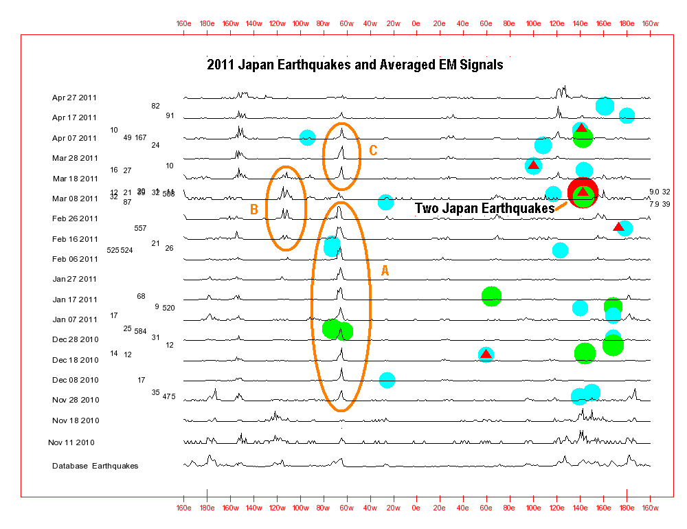
The chart below represents an Extremely Important example
of one of the Earthquake Forecasting Procedures that are
being discussed on this Web page. It focuses on the powerful
and incredibly destructive December 26, 2004 Indonesia area
earthquake that reportedly claimed more than 200,000 lives!
2004/12/26 00:58:53 3.3N 95.98E 30 9.1
"off the west coast of northern Sumatra"
There are more data for that
earthquake on the Significant
Earthquakes Web page. It is also discussed in much more
detail in the Comparing Averaged EM Signal
Line Peak Longitudes with
Individual Earthquake Longitudes
section of this present Web page. The following highly
destructive March 28, 2005 Indonesia area earthquake is also
shown on the chart below and discussed in that Web page section.
2005/03/28 16:09:36 2.08N 97.11E 30 8.6
"northern Sumatra, Indonesia"
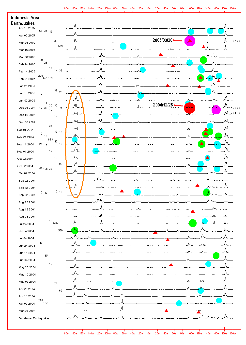
The chart shown here is a
specially created version of the Data.html
Web Page's Year Chart. It was generated for parts of
the years 2004 and 2005 rather than for a specific year. The
chart area circled in orange is the focus of the discussion that can
be found just below the chart.
FOUR
IMPORTANT LONGITUDE LOCATIONS
The example being discussed
here involves watching for earthquake precursors at four
different longitudes rather than just one longitude.
The previously discussed
especially simple introductory examples of how to use these Chart
Data and Table Data focused on a deadly Chile area
earthquake that occurred around the 71 W longitude line. This
present introductory example involves a more complex, but still relatively
simple application for making use of those chart line peak
longitude data.
Basically, the computer program
that generates these charts and tables considers earthquake
longitudes that are 90, 180, and 270 longitude degrees to the east
or west of one another to be the same as far as the calculations are
concerned. So, an earthquake that was going to occur at 96 E
as that devastating December 26, 2004 Indonesia area earthquake did
could have line peak longitudes appear on the charts at 96 E and
also at longitudes that are 90, 180, and 270 degrees to the east and
west of 96 E, namely, 174 W, 84 W, 6 E, and 96 E.
The chart below shows what the
above chart would look like if it had orange vertical lines drawn at
those four longitudes. The two highly destructive 2004 and
2005 Indonesia area earthquakes can also be seen on the chart.
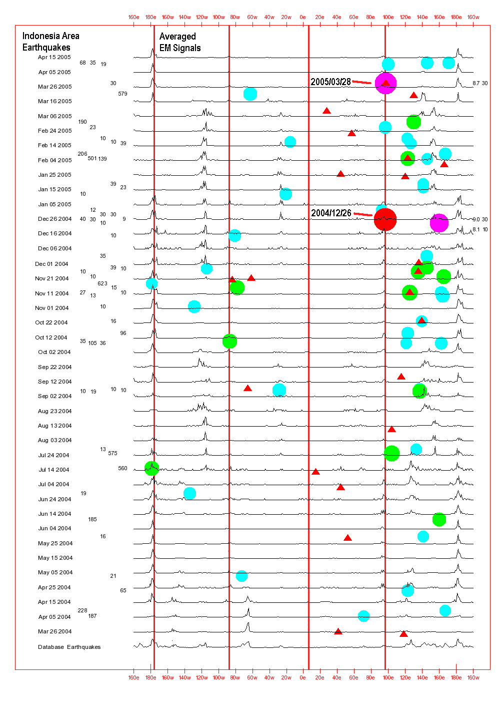
Beginning around September 2, 2004, strong line peaks began
appearing on the chart at about 174 W (96 E - 270
degrees). They then remained at that longitude until
January 5 of 2005, a period of roughly 4 months. With this
more complex version of this particular earthquake forecasting
procedure, that persistent line peak at a single longitude meant
that a significant earthquake might be approaching for some
fault zone along the 174 W, or 84 W, or 6 E, or 96 E longitude lines.
It is expected that it
was highly unlikely that there were many other
earthquake precursors visible during those 4 months along the
174 W, 84 W, or 6 E longitude lines.
On the other hand, it
is expected that there WERE
quite a few earthquake precursor signals that could have
been detected during that time around the 96 E
longitude line, especially at 3 N where the earthquake occurred.
If earthquake forecasters
had been aware back then that they should be checking for
earthquake precursors along any of those four longitude lines
then it is possible that some precursors such as Jet Steam
Anomalies and Total Electron Content signals might
have been detected in the area of the approaching Indonesia area
earthquake. People living and working in the area could
have been warned about a possible approaching significant
earthquake. And perhaps some of those more than
200,000 lives lost because of the earthquake and associated
tsunami might have been saved!
Unfortunately, not all approaching significant earthquakes
result in line peaks appearing on the charts and tables at the
actual longitude of the earthquake or at one of its other three
associated longitudes. But as the above Chile and
Indonesia area earthquake examples clearly show, those line
peaks can be accurate indicators of approaching seismic activity
for at least some
significant earthquakes.
Considering the number of
lives that might be saved if just one approaching significant earthquakes could
be accurately predicted, it would be well worth the
effort for world governments and international
earthquake forecasters to regularly carefully study these
charts and tables and attempt to see if other earthquake
precursors might be observable along the single longitude
line, or the other three longitude lines of interest.
In summary, the earthquake
forecasting procedure discussed above is similar to the ones discussed
earlier. It simply involves checking for earthquake precursors
along 4 longitude lines instead of just one.
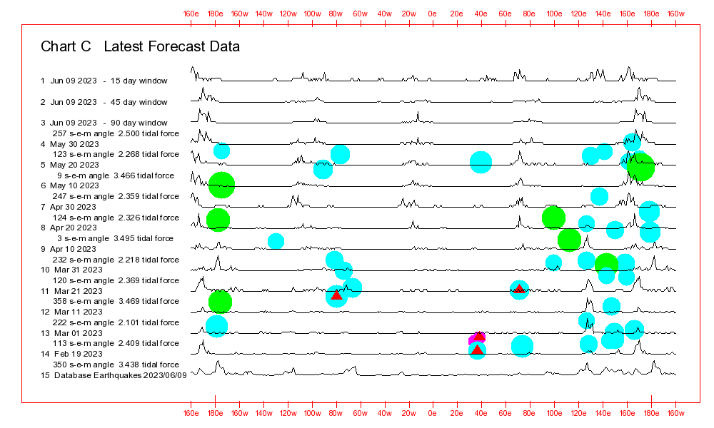
HOW TO USE THE DATA.HTML
WEB PAGE DATA
TO FORECAST EARTHQUAKE AFTERSHOCKS
Another especially
important example of how earthquake aftershocks can be forecast with
these data can be found in the:
"A More Complex
Earthquake Forecasting Procedure That Involves Comparing: Four Averaged
EM Signal Line Peak Longitudes with Individual Earthquake
Longitudes"
Section of this Web page. That example
involves the devastating March 28, 2005 Indonesia area aftershock
for the even more destructive December 26, 2004 Indonesia area
earthquake.
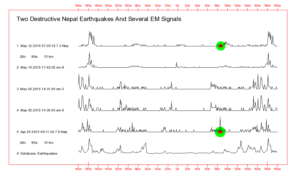
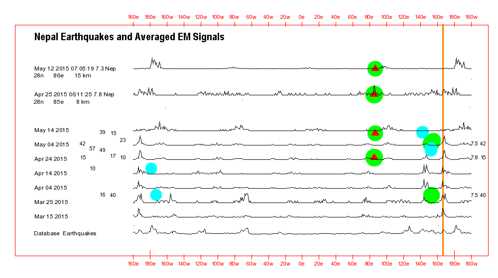
THE TWO
DESTRUCTIVE 2015 NEPAL AREA
EARTHQUAKES
2015/04/25 06:11:26 28.15N 84.71E 15 7.8 34km ESE of
Lamjung, Nepal
2015/05/12 07:05:19 27.84N 86.08E 15 7.3 18km SE of
Kodari, Nepal
The destructive 2015 Nepal
earthquakes-related picture file shown below is a "Computer
Monitor Screen Capture" image of one of the Multiple
Window Chart Viewers on the Data.html
Web page. The image was created by using the Windows Print Screen keyboard button
and an Image Processor
type of computer program plus Windows Paste (or CTRL v).
Some researchers might prefer
to create paper printouts of sections of the various charts on the
the Data.html
Web page and then compare the printouts with one another.
Multiple reduced size computer monitor windows can also be used to
display several charts at the same time. The Alt Tab
keys can then be used to move from one window to another.
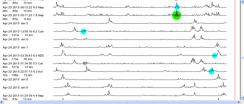
The EQ-EMS (Earthquakes and high intensity EM Signals) chart for the year 2015 is displayed in
both the upper and lower viewer windows of the chart below.
Three important dates have been circled.
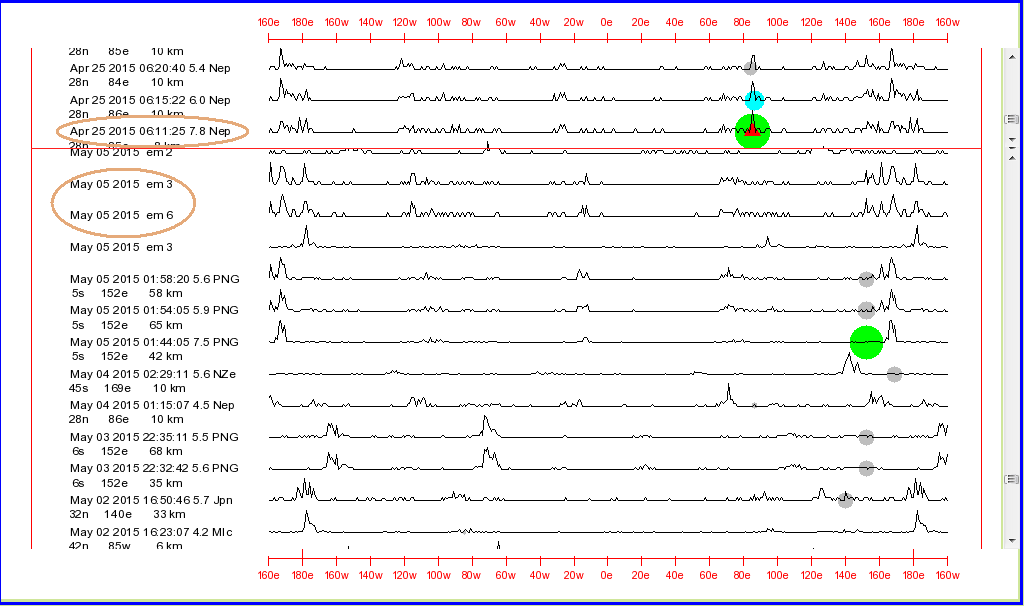
The large
circles or dots on the above chart indicate the longitudes of and
the relative magnitudes of different earthquakes. Each
magnitude number, such as 7, has a different color circle. A
red triangle in the center of a circle indicates that the
earthquake directly or indirectly resulted in fatalities.
In the upper viewer window of
the chart the line shape for the following highly destructive
April 25, 2015 Nepal earthquake can be seen. On the left
side of the chart the earthquake's data are circled in orange.
2015/04/25 06:11:26 28.15N 84.71E 15 7.8 34km ESE
of Lamjung, Nepal
In the lower window of the
chart the line shapes for a number of EM Signals can be
seen. Two of those EM Signals that are of special interest
were detected about 10 days after the April 25 earthquake.
On the left side of the chart those signals have their detection
dates circled in orange.
As can be seen with the
above chart and even more easily with the chart below, those two
EM Signal line shapes were strikingly
similar to the line shape of the highly destructive April 25
Nepal earthquake.
It is believed
that those similar line shapes indicated that a powerful
earthquake aftershock might be about to occur!
On May 8, 2015, several days
after those EM Signals were detected, this Web page's author
circulated an
International Earthquake Aftershock Warning
for Nepal. The following, expected Nepal aftershock occurred
four days later, on May 12.
It was highly
destructive!
2015/05/12 07:05:19 27.84N 86.08E 15 7.3 18km SE of
Kodari, Nepal
It is believed that the
above example clearly demonstrates that at least SOME
earthquakes CAN be predicted using these line shape
comparison techniques!
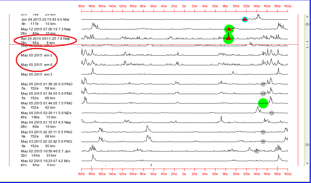
The chart below displays the Individual earthquake line
shapes for the two highly destructive 2015 Nepal area earthquakes
(the top two data lines) plus the Averaged
EM Signal data lines for around the time when the earthquakes
occurred.
The Nepal earthquakes
themselves are also displayed within that Averaged EM Signal section. The Averaged EM Signal section is
from the Data.html
Web page's Year Charts
picture file.
The first earthquake, or
perhaps both, were likely responsible for the Averaged EM Signal data lines
seen before the first earthquake. However, the database file
used by the earthquake forecasting computer program does not have a
large number of earthquake entries for the area where those
earthquakes occurred. Most likely, partly for that reason, the computer
program was not able to effectively use its data comparison
procedures in order to point clearly to the locations of the
approaching earthquakes.
The vertical orange line on the
chart around 165 E and the data lines for the first earthquake and
the Averaged EM Signals do
indicate that there was likely at least some common features of the
earthquake and Averaged EM
Signal lines seen before the first earthquake.
Interested Web page viewers
could use the Multiple Window
Viewers on the the Data.html
Web page to computer those two earthquakes with the EQ-EMS-2015.png
chart's high intensity EM Signals that were detected back in
2015. That might provide them with some additional information
regarding the quality of the matches between the earthquakes and the
high intensity EM Signals that were detected around that time.
I myself don't have time to
study every past destructive earthquake in detail. There are
presently some 800 of them in my data records.
Those two highly destructive 2015
Nepal area earthquakes are discussed in much more detail in the:
"Comparing: Individual
EM Signal Line Peak Shapes With Individual
Earthquake Line Peak Shapes"
Section of this Web page.
AN EXTREMELY
SIMPLE
EARTHQUAKE FORECASTING PROCEDURE
THAT INVOLVES COMPARING:
Averaged EM Signal Line
Peak Longitudes
With
Individual Earthquake Longitudes
This earthquake forecasting
procedure was briefly described in the earlier examples sections of this Web
page. This is a procedure that forecasters can use it to quickly
and easily tell when and where at least some approaching
significant earthquakes and aftershocks are going to occur.
A number of earthquakes
including the January 20, 2019 Chile area earthquake discussed above
will be used as examples of how this especially simple earthquake
forecasting procedure works.
It involves comparing the Averaged EM Signal line peak
longitudes on the Data.html
Web page's Chart C, Chart A, or the Year Chart with the longitudes
of Individual past
earthquakes. In some cases the line peaks will be accurate
indicators that an earthquake is approaching for a fault zone
somewhere along the longitude line of the line peaks.
The expected earthquake might
even occur in the same area where one of those Individual
past earthquakes occurred.
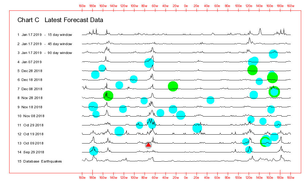
Chart C shown below is
the uppermost chart displayed on the Data.html
Web page. It shows the latest Averaged EM
Signal data plus the latest data for 5.5 and higher magnitude
earthquakes.
See the Comments And Reference Information Section
for explanations of what types of information the various circles or
line peaks the above Chart C represent and what the
differences are between Chart C and Chart A.
Both of those charts can be seen on the Data.html
Web page.
With this first simple
Earthquake Forecasting Procedure, earthquake forecasters should
regularly check the Data.html
Web page to see:
If Chart C or the Year Chart:
--- Have a line peak at some longitude that is of interest
to them
--- That line peak has been stationary at the longitude of
interest for a month or more
When they see those two things
happen they should examine other earthquake precursor data such as Jet
Stream Anomaly data and Total Electron Content data to
see if a powerful earthquake might be about to occur somewhere along
that longitude line.
It is unfortunate that this
especially simple earthquake forecasting procedure works for only a
relatively small percentage of our approaching
significant earthquakes. But as the examples shown below
demonstrate, in spite of that reliability limitation, the procedure
can at times quickly and easily provide earthquake forecasters with
invaluable data regarding the approach of a destructive earthquake.
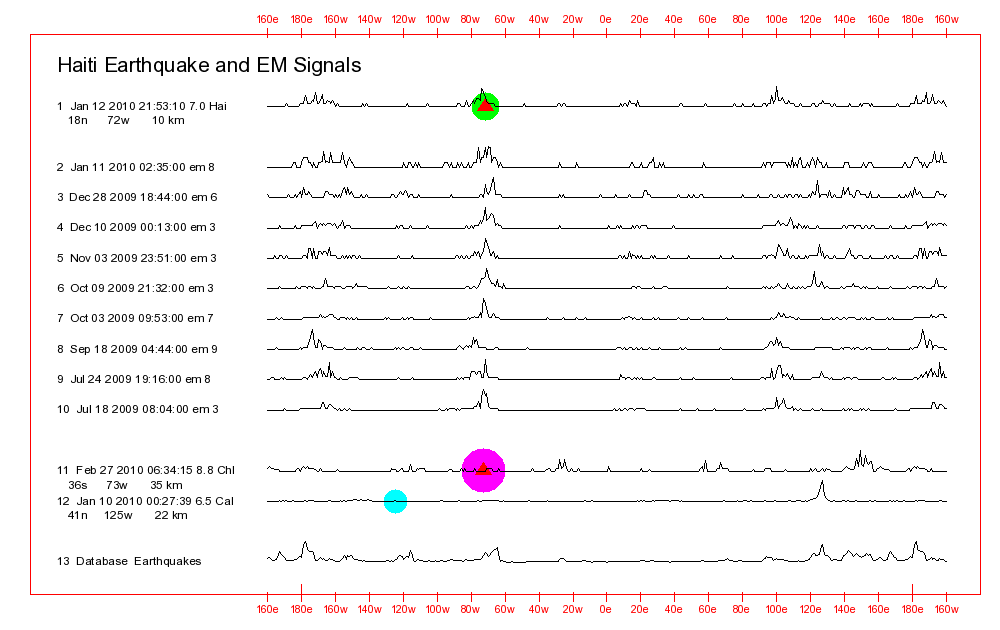
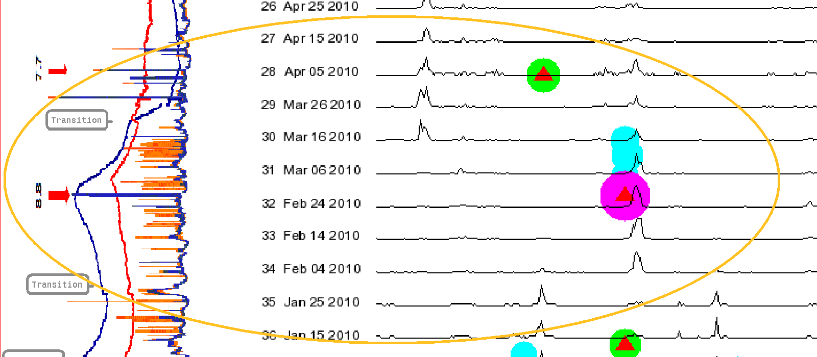
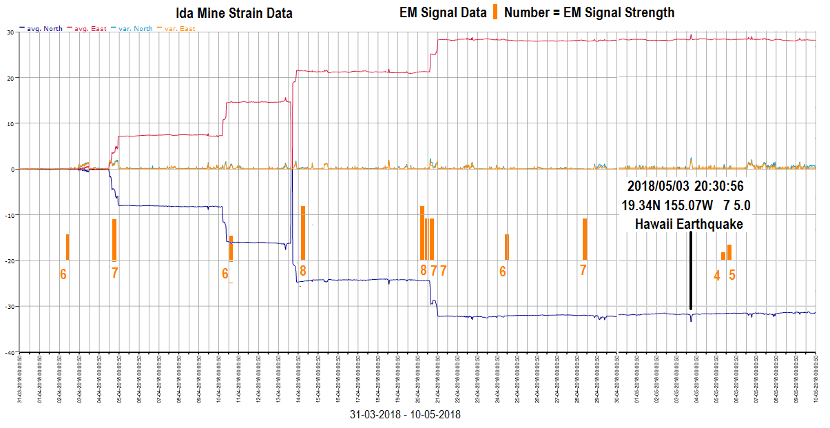
THE DESTRUCTIVE FEBRUARY
27, 2010 CHILE AREA EARTHQUAKE
2010/02/27 06:34:11 36.12S 72.90W 23 8.8 "offshore
Bio-Bio, Chile"
The chart below is a section of
the Data.html
Web page's Year Charts Averaged EM Signals picture
file plus the line shapes for that Chile area earthquake, two Haiti area earthquakes, and a Canada area earthquake.
It can be seen with the above
chart that there are line peaks at around 70 W longitude going back
to February 4, 2010, a month before that destructive Chile
earthquake occurred. It is believed that those line peaks were
likely indicating that the earthquake was approaching.
The line peaks disappeared from
that longitude a little over a month after the earthquake
occurred. That fairly rapid disappearance is another indicator
that the line peaks were likely associated with the approach of that
specific, especially powerful earthquake.
They might have remained there
for that long because of aftershocks that continued for some
time. They could have remained there because of the lengthy
90 day EM Signal averaging Time Window. Some of the stronger
EM Signals would have remained in and influenced line peaks in that
Time Window for a while.
They could have remained there
because of that approaching Canada earthquake shown in the top section of the above chart that had a line peak at
around 65 W.
2010/04/04 22:40:42 32.29N 115.30W 10 7.2 "12km SW of Delta, B.C., MX"
Tables on the The Significant-Earthquakes
Web page report that the February 27, 2010 Chile area earthquake resulted in the loss
of about 480 lives. Had these Chart C data been both available
to and used by earthquake forecasters at that
time then this especially simple forecasting procedure might have
enabled them to detect the approach of the earthquake.
Some of those 480 lost
lives might have been saved!
It can be seen on the above
chart that there were strong line peaks at about 117 W prior to
February 4, 2010. Those line peaks are good matches for the
line shape of the approaching
February 27, 2010 Chile earthquake that is shown at the top of the
chart. So, they were likely associated with the Chile earthquake. But because of the way that fault zones can
interact with one another, it is possible that those line peaks were
linked with both the approaching Chile and January 12, 2010 Haiti
earthquakes.
That February 27, 2010 Chile
area earthquake is also discussed in the:
"Compare Averaged EM Signals With Other
Precursors"
Section of this Web page. In that
section the Averaged EM Signal data lines are compared with
Fault Zone Strain data that were generated by an earthquake
forecasting group based in the Europe area.
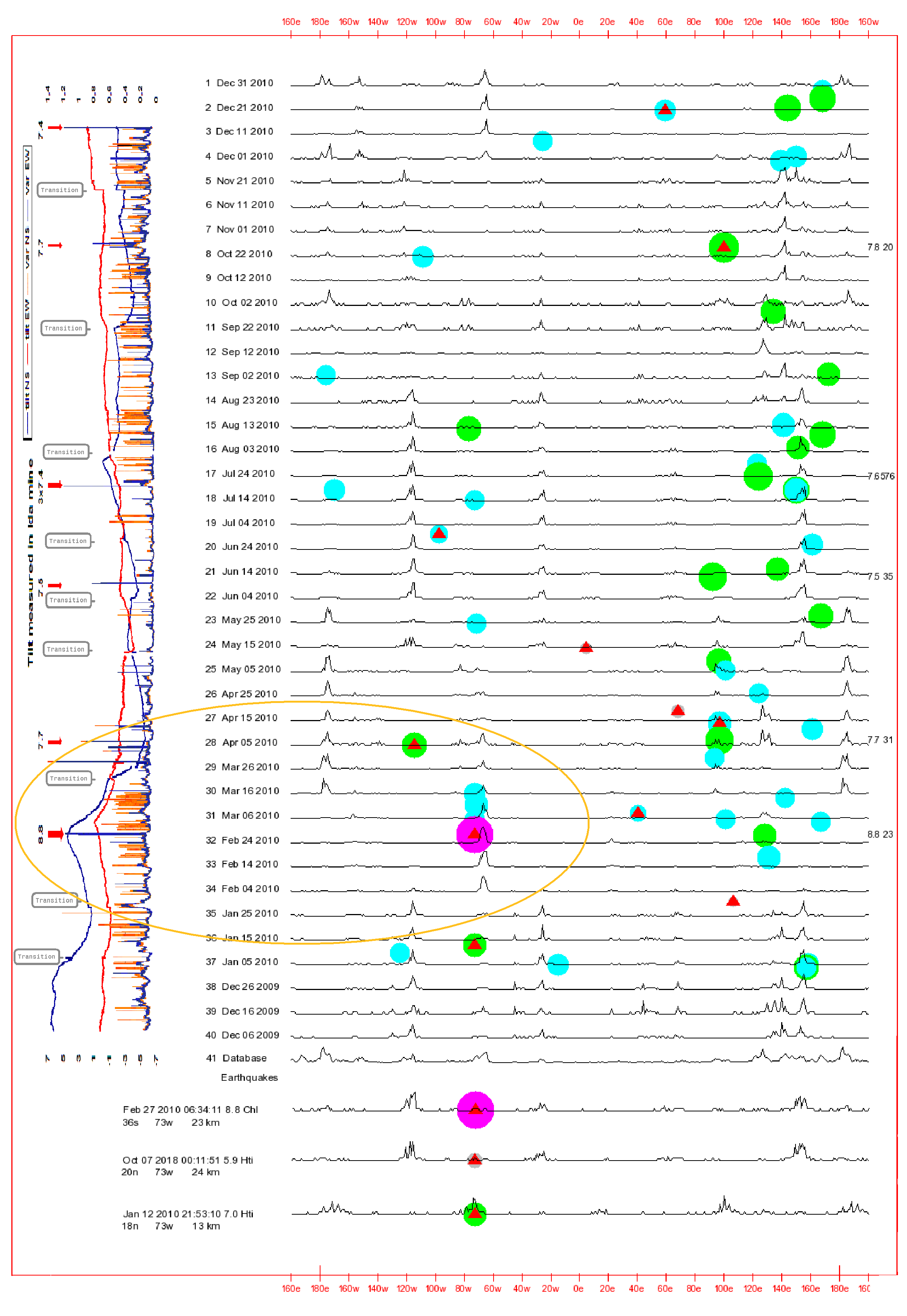
THE DESTRUCTIVE JANUARY 20,
2019 CHILE AREA EARTHQUAKE
2019/01/20 01:32:51 30.07S 71.42W 53 6.7 "15km SSW
of Coquimbo, Chile"
That earthquake has already
been briefly discussed on this Web page. The following is a
more detailed discussion.
Chart C, the Year
Chart, and several other charts displayed on the Data.html
Web page are usually updated when high intensity EM Signals are
detected or when a Significant Earthquake occurs.
Several past versions of Chart
C shown below demonstrate how this first, simple forecasting
procedure might have been used to detect the approach of that
January 20, 2019 Chile area earthquake.
The First Chart In This Series
The chart shown below is
one that was generated around January 24, 2019, several days after
the earthquake occurred. It shows the earthquake itself
(circled in orange) plus line peaks that were present around 71 W
(actually more like 65 W) going back to around October 6 of
2018. It is believed that those line peaks were accurate
indicators that the earthquake was approaching.
The Second Chart In This Series
The chart shown below was
generated around January 17, 2019, several days before
the earthquake occurred. So the circle or dot for the
earthquake is not yet visible at 71 W longitude on this
version of Chart C.
The chart has been included
here to show what these charts can look like just before a Significant
Earthquake occurs.
As with the first chart in this
series, the above chart also shows that the line peaks began
appearing in the 71 W longitude area in early October of 2018, right
after a deadly earthquake occurred in Haiti. There were no
line peaks in the 71 W area before that deadly, but much less
powerful Haiti earthquake (15 reported fatalities).
2018/10/07 00:11:51 20.03N 73.02W 24 5.9 "21km WNW of
Ti Port-de-Paix, Haiti"
The Third Chart In This Series
The chart shown below was
generated around March 29, 2019. It also shows that the line
peaks disappeared completely from the 71 W longitude area shortly
after the earthquake occurred.
The Fourth Chart In This Series
The chart shown below is the
final one in this series. It is part of a 2019 Year Chart
that was generated around March 29, 2019.
The Year Charts display
EM Signal data for more than a year versus Chart C and Chart
A. Those two charts display only about 3 months worth of data.
With this chart it can easily
be seen how line peaks appeared around the 71 W longitude area long
before the earthquake occurred. And they disappeared
completely from that longitude shortly after it occurred.
For reasons that probably have
to do with the nature of the South America West Coast fault zones,
this first relatively simple forecasting method appears to work
especially well with detecting the approach of earthquakes that are
going to occur along the coast of Chile.
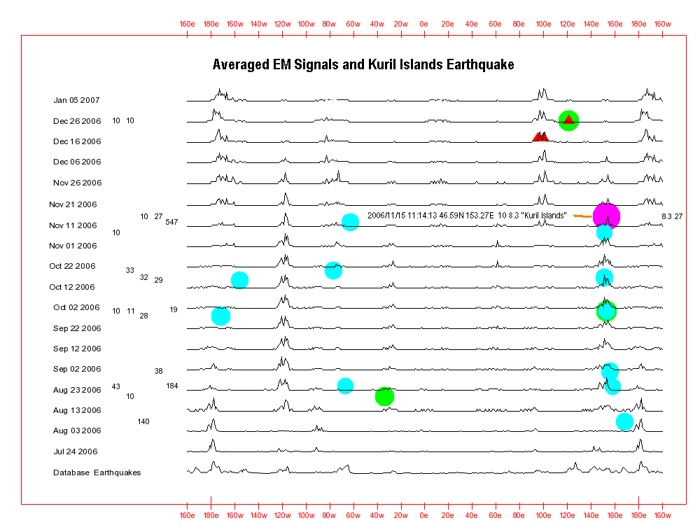
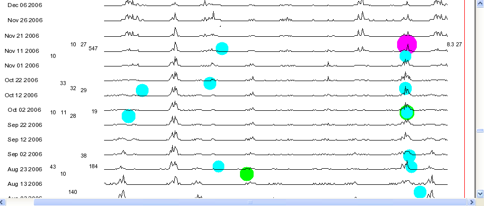
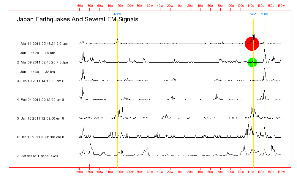
THE POWERFUL NOVEMBER 15,
2006 KURIL ISLANDS EARTHQUAKE
2006/11/15 11:14:13 46.59N 153.27E 10 8.3 "Kuril Islands"
The chart shown below is a section of the Data.html
Web page's Averaged EM Signals Year Charts picture file for around the year 2006. It focuses on that extremely powerful Kuril Islands earthquake.
It can be seen on the above
chart that line peaks began appearing in the 153 E area as far back
as the middle of August, 2006. That was months before that especially high magnitude
Kuril Islands area earthquake. And they disappeared from that
longitude immediately after the earthquake occurred.
It is believed that those 153 E
area line peaks were accurately indicating that the powerful Kuril
Islands earthquake was approaching.
Persistent line peaks can also
be seen before and after that earthquake at around 117 W on the
chart. Those line peaks are significant. They were
likely also related to the approaching Kuril Islands earthquake and
will be discussed in the following section of this Web page:
A
More Complex Earthquake Forecasting Procedure That Involves
Comparing: Four Averaged EM Signal Line Peak Longitudes With Individual
Earthquake Longitudes
SUMMARIZED
STEPS FOR USING THE ABOVE,
SIMPLE, LINE SHAPE COMPARISON
PROCEDURE
The following is a
summarized list of the steps involved with using the above, extremely
simple Line Shape
Comparison Procedure to watch for new earthquakes or
aftershocks that might be approaching for some location of interest:
Step # 1 - In one of the upper windows of any of the
Multiple Window Chart Viewers on the Data.html
Web page, use any of that Web page's charts such as the Significant
Earthquakes Sorted By Date Chart to display a
past earthquake that is of interest to you.
Step # 2 - In one of the lower windows of that Multiple
Window Chart Viewer, display the most recent version of Chart
C, Chart A, or the Year Chart.
Step # 3 - Scroll the chart in the lower window up
and down to determine if there are line peaks on the data lines
that are located at the same longitude as the earthquake that is
of interest.
When earthquake
forecasters around the world determine that there is such a match,
they should attempt to determine if there are other earthquake
precursors such as Jet Stream Anomalies or Total
Electron Content signals that are being detected at the
location of the earthquake that is of interest to them.
COMMENTS
REGARDING THIS FIRST, EXTREMELY
SIMPLE EARTHQUAKE FORECASTING PROCEDURE
For the important reason being
discussed here, earthquake forecasters, disaster management
personnel, news service personnel, government officials, and members
of the general public who are interested in earthquake forecasting
should examine the Year Charts shown on the Data.html
Web page.
Those charts display EM Signals
and earthquake data going back to the start of 2001. People
should attempt to determine if this first, especially simple
forecasting procedure was successful with pointing to
the approach of past significant earthquakes that are
of interest to them, such as destructive ones that occurred near
where they live or work.
In cases such as the ones
previously discussed on this Web page where this procedure did
appear to be successful with detecting the approach of an
earthquake, earthquake forecasters should attempt to determine if
there were other observable earthquake precursors at that time that
also pointed to the earthquake's approach. I would be
interested in hearing about any such cases and can be contacted
regarding them at: webmaster@earthquake-research.com
The Earthquake
Forecasting Breakthroughs Web page contains discussions and
data for a number of past earthquakes where this forecasting method
and others appeared to be pointing to the approach of the same
earthquakes at around the same time.
This first, relatively simple
earthquake forecasting procedure appears to work best for locations
where there have been numerous powerful and significant earthquakes
in the past. That is most likely because the forecasting
procedure relies on a database file that contains records of more
than 110,000 five and higher magnitude earthquakes that occurred
going back to the beginning of 1973. The computer programs
that generate the forecasting charts and tables compare data
associated with recently detected EM Signals with similar data for
all of those records of past earthquakes.
With some locations such as the
Japan area and the west coast of South America, especially the Chile
area, there are numerous records in the database file for relatively
high magnitude past earthquakes. With other areas such as the
Nepal area where few powerful earthquakes have occurred since the
beginning of 1973 there are relatively few records in the database
file. As a result, with some areas the earthquake forecasting
computer programs have little or no data to use for comparison
purposes.
Another researcher's and my own
studies have indicated that significant earthquakes generally occur
where there have been significant earthquakes in the past. So,
the tendency for this especially simple forecasting method to favor
locations were there have been numerous past significant earthquakes
might be of benefit.
When people examine the Year
Charts on the Data.html
Web page they will observe that quite often, these EM Signal line
peaks will remain at some longitude for as long as a half of a
year. And they might ask:
Question: How can determinations be made regarding exactly
when expected earthquakes are going to occur when Averaged EM
Signal line peaks point to the same longitude for such long
periods of time?
The answer is that other
forecasting methods or procedures have to be used to get that Exact
Occurrence Time information.
One such method that often
produces good results has to do with a careful evaluation of the Individual
high intensity EM Signals that are used to generate those Averaged
EM Signal line data lines. Those Individual EM Signals can be
seen on the EMS-(year).png and EQ-EMS-(year).png charts on the Data.html
Web page for years going from the present back to 2001.
When two or more of those high
intensity EM Signals are detected within a few hours of one another,
then perhaps 50% of the time, that can serve as a good indicator
that an expected earthquake will occur in less than a week.
When people examine the Year
Charts on the Data.html
Web page they will also observe that at times, these Averaged
EM Signal line peaks appear to be accurately pointing to the
approach of some earthquake. But then the longitudes of the
line peaks change a month or two before the earthquake occurs.
And they no longer point to the right longitude.
Several theories for why that happens at
times are presently being evaluated.
A MORE COMPLEX EARTHQUAKE
FORECASTING PROCEDURE
THAT INVOLVES COMPARING:
Four Averaged EM Signal Line
Peak Longitudes
With
Individual
Earthquake Longitudes
The earthquake forecasting
procedure being discussed in this section of this Web page is
essentially a more complex version of the first,
especially simple earthquake forecasting procedure
that was described in the above sections of the Web page.
With the previously discussed
simpler procedure, earthquake forecasters would watch for
earthquakes that might occur in a fault zone somewhere along a
single Averaged EM Signal line peak longitude line.
With this second more complex
procedure, they would also watch for earthquakes that might occur in
fault zones along that same longitude line plus longitude
lines that are 90, 180, and 270 longitude degrees to the east or
to the west of the Averaged EM
Signal line peak longitude line.
So, if a line peak appeared on
the charts at 135 W, earthquake forecasters would need to
check for possible earthquakes at:
135 W
and also:
45 W (135 W
+ 90),
45 E (135 W +
180), and
135 E (135 W + 270)
It would be important to check
all of those longitude lines because the computer program that
generates these charts regards longitude lines that are 90, 180, and
270 to the east and west of one another as being largely the
same. So, line peaks might start appearing around 60 W
longitude at some point in time. But they might actually
be indicating that an earthquake was approaching for 30 E longitude
(60 W + 90 degrees to the east).
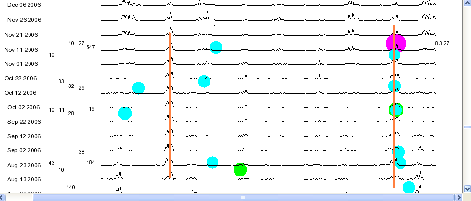
THE POWERFUL NOVEMBER 15,
2006 KURIL ISLANDS EARTHQUAKE
2006/11/15 11:14:13 46.59N 153.27E 10 8.3 "Kuril Islands"
As discussed in the previous
section, this powerful Kuril Islands earthquake is again being used
as an example of how one of these earthquake forecasting procedures
works.
The two charts below are
basically the same.
With the first one there are no
orange vertical lines. And the chart line peaks can be easily
seen.
With the second one, orange
vertical lines have been drawn at 117 W and 153 E. 117
W is 270 degrees to the west of 153 E. For the sake of
simplicity, orange vertical lines have not been drawn on the
second chart at the other two important longitudes, 27 W and 63
E. Those longitudes would be 180 and 90 degrees to the west of 153
E.
The line peaks around 117 W are
both clearer and more persistent on the chart than the ones around
153 E. And as with the ones at 153 E, the line peaks at 117 W
disappeared shortly after the earthquake occurred.
It is believed that the line
peaks at both longitudes were accurately indicating that the
powerful Kuril Islands area earthquake was approaching. The
ones at 117 W longitude were drawn there by the computer program
because of the way it does its calculations.
Those particular 117 W
area line peaks likely did not have their origins in and
were not indicating that an earthquake was approaching
for the 117 W area.
It is believed that before the
earthquake, other earthquake precursors would have been detectable
at the 153 E location of the earthquake. But,
they would not have been detectable anywhere
along the 117 W longitude line even though there were strong line
peaks at that longitude on the chart.
THE ABSOLUTELY
CATASTROPHIC
DECEMBER 26, 2004 INDONESIA AREA
EARTHQUAKE
AND ITS HIGHLY DESTRUCTIVE MARCH 28,
2005 AFTERSHOCK
2004/12/26 00:58:53 3.3N 95.98E 30 9.1
"off the west coast of northern Sumatra"
2005/03/28 16:09:36 2.08N 97.11E 30 8.6
"northern Sumatra, Indonesia"
There was a preliminary
discussion of that first Indonesia earthquake in the Introductory
Examples section of this Web page. The following
is a more detailed discussion of both of those devastating earthquakes.
Tables on the Significant-Earthquakes
Web page report that the year 2004, extremely powerful Indonesia area earthquake resulted in
the loss of more than 200,000 lives spread over a number of
countries. Most of those lives were reportedly lost as the
result of the tsunami that followed the earthquake.
The March, 2005 aftershock reportedly claimed another 1000 lives.
The chart below pertains to that
2004 earthquake and its year 2005 aftershock. This chart displays
perhaps the most disturbing earthquake forecasting
data that I have ever seen.
It was not until early in
2019 when I finally had time to carefully study the chart below that I could finally
understand the significance of these data!
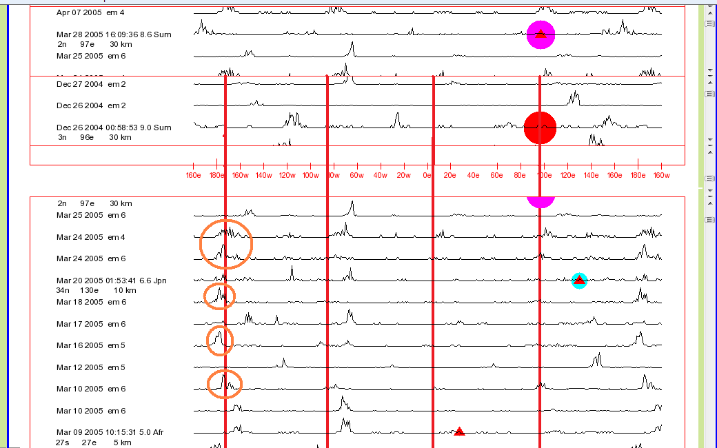
The chart below is a special Year
Chart that shows Averaged EM Signal data and
Earthquake data going from April of 2004 through April of
2005. The incredibly devastating December 26,
2004 Indonesia earthquake is displayed on the chart as a large red
colored circle or dot. The 2005 aftershock is displayed as a large
blue or purple dot.
With the above chart there are
orange lines drawn on the chart at 96 E where the earthquake
occurred and also 90, 180, and 270 degrees to the east and west of
there. So, the four orange lines are at 174 W, 84 W, 6 E, and
96 E. This more complex earthquake forecasting
procedures explains that if line peaks are present at any of those
four possible longitudes, then an expected approaching earthquake
could occur along one of those longitude lines.
As the chart shows, a strong Averaged
EM Signal line peak began to appear at about 174 W around September
12 in 2004. That was a full two and a half months
before that absolutely devastating earthquake! The line peaks
then totally disappeared from 174 W shortly after the earthquake
occurred.
The chart also shows
that there were strong line peaks appearing in the 174 W area back
as far as April 15, 2004. My present theory is that those line
peaks were likely linked with both the approaching Indonesia
earthquake and the powerful July 15, 2004 Fiji area earthquake that occurred
at 179 W.
2004/07/15 04:27:11 17.24S 178.93W 560.0 7.1 FIJI REGION
The line shape for that Fiji
earthquake can be seen on the second chart below.
All of that information suggests to me that
the absolutely catastrophic 2004 Indonesia area earthquake might have been generating
highly detectable earthquake precursor signals for as long as eight
and a half months before it occurred. If earthquake
forecasters had known what to watch for at that time then people
might have been warned to be ready for the earthquake.
Countless numbers of lives might have been saved!
The second devastating
earthquake (an aftershock) that occurred in the Indonesia area a few months later is
discussed in additional detail in one of the other sections of this Web page.
2005/03/28 16:09:36 2.08N 97.11E 30 8.6
"northern Sumatra, Indonesia"
The chart below displays the
2004 earthquake and shows the locations of those four
earthquake-related longitudes (orange vertical lines - center viewer
window). The lowest viewer window displays several EM Signals
(circled) plus extensions of those four orange vertical lines.
The 2004 earthquake occurred at
96 E. So the four longitudes to be used for comparison
purposes are 174 W, 84 W, 6 E, and 96 E.
For comparison purposes, the
powerful and destructive 2005 Indonesia aftershock is displayed in
the top viewer window. It is also partly visible in the lowest
viewer window because of the previously discussed Chart Viewer resolution
limitations.
During the week before the 2005
earthquake occurred, a number of Individual EM Signals were
detected. They had strong line peaks around 174 W. And
they are circled in the lowest viewer window of the above
chart. And there were smaller EM Signal line peaks around 96
E.
174 W is 270 degrees to the
west (or 90 degrees to the east) of the 96 E longitude degree 2004
earthquake. The 2005 aftershock was at 97 E.
Those EM Signals and probably quite a
few others were likely indicating that the deadly 2005 Indonesia
area aftershock was getting ready to occur. It might have
been accurately predicted had earthquake forecasters been watching
for an aftershock.
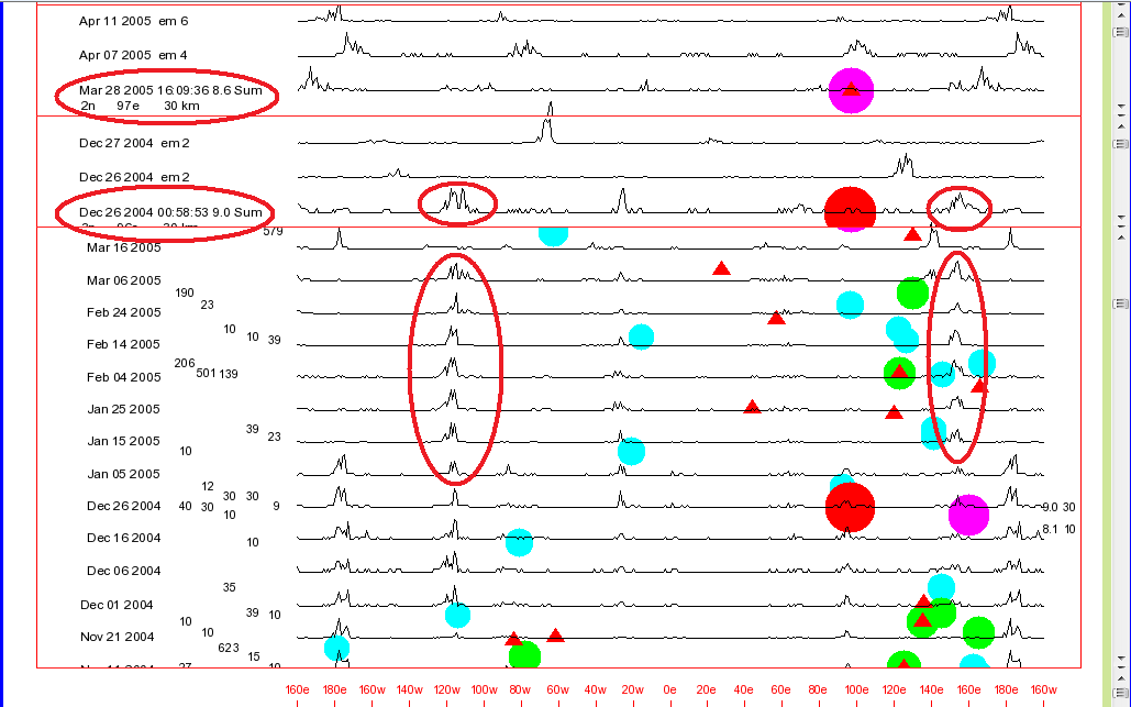
The chart below displays a
number of 2004 and 2005 earthquakes plus part of the Year Charts
picture file that shows Averaged EM Signals from around that
time. There are yellow or orange vertical lines drawn at 174
W, 84 W, 6 E, and 96 E. There is also another special
yellow line drawn at around 117 W longitude.
To more easily study the chart,
Web page visitors might want to open two reduced size browser
windows displaying this Web page. The top browser would show
the top of the chart. The lower browser window would display
the lower part of the chart. And that lower window could be
easily scrolled up and down so that the chart contents could be
compared with the upper browser window.
As the discussion beneath the
chart demonstrates, interpreting these chart data can be a complex
process.
The first devastating Indonesia
earthquake from that time period occurred on December 26, 2004. If the Averaged
EM Signal
line shapes are examined for the time period just before the
earthquake occurred, it can be seen that there are strong line peaks at
both
174 W and 117 W.
The present belief is that the
ones at 174 W were indicating that the December 26, 2004 Indonesia
earthquake was approaching (174 W - 270 degrees = 96 E). But
that is likely also the case for the line peaks at 117 W. If
the top section of the chart is examined it can be seen that the
line shape for the earthquake itself displayed a strong line peak at
117 W.
To explain that as simply as
possible, the computer program being used to generate these chart
determined that the approaching December 26 earthquake was going to
be triggered by sun and moon gravity-related forces that were
similar to the same types of forces that triggered earthquakes in
that past that had occurred at 117 W (or 27 W, or 63 E, or 153
E). So it drew a line peak at 117 W in addition to the ones it
was drawing at 174 W.
Instead of disappearing right
after the earthquake occurred, the 117 W line peaks persisted for a
while. And that suggested that there could be some strong
aftershock activity approaching. There was, in the form of the
powerful and highly destructive March 28, 2005 Indonesia area
aftershock. That warning might have been further amplified by
the fact that the line peaks started to appear again at 174 W a
short time before the aftershock.
The 174 W line peaks remained
there after the Indonesia aftershock possibly because of the
approach of one or both of two powerful and destructive
earthquakes. The first occurred in the Chile area and
reportedly claimed about a dozen lives.
2005/06/13 22:44:33 19.99S 69.20W 116 7.8 "Tarapaca, Chile"
As data in the top section of the above chart and also charts on the Significant
Earthquakes Web page show, that Chile earthquake data line had a strong line
peak around 180 W.
The second earthquake, also shown
in the top section of the above chart was the October 8, 2005
Pakistan earthquake that had a major line peak at 174 W.
It reportedly claimed some 90,000 lives!
2005/10/08 03:50:40 34.54N 73.59E 26 7.6 "Pakistan"
As stated repeatedly on Web
pages at this Web site, interpreting these data can be
complicated. But considering the fact that those two Indonesia area
earthquakes added to the one in Pakistan reportedly claimed some
350,000 lives, it would be well worth the effort for earthquake
forecasters and researchers around the world to learn how to
interpret the data.
Comment: My data indicate that there are many more important
things that earthquake forecasters and researchers need to know about
those two Indonesia area earthquakes and other significant earthquakes.
For one example, it is likely quite
significant that when that first Indonesia earthquake occurred, the sun
and the moon were above locations that were on almost exact opposite
sides of the Earth from one another. Their being in those
locations would then have a major impact on the strength and direction
of a number of tidal effects.
For another example, at the time of
that first earthquake, the sun was at about the farthest south that it
travels relative to the equator. Also around that time, the Earth
was at about its closest point to the Earth in its yearly obit around
the sun. And that means that it was at its greatest velocity in
its yearly orbit. Certain Earth acceleration-related forces would
also be affected.
Some of those Earth acceleration types of forces can be seen on the picture charts in the:
Section of this Web page.
THE TWO
DESTRUCTIVE 2015 NEPAL AREA EARTHQUAKES
2015/04/25 06:11:26 28.15N 84.71E 15
7.8 34km ESE of Lamjung, Nepal
2015/05/12 07:05:19 27.84N 86.08E 15 7.3 18km SE of
Kodari, Nepal
The earthquake
forecasting procedure that was just discussed in regard to the two
highly destructive Indonesia area earthquakes might have also been used
in connection with the above two destructive Nepal area
earthquakes.
See the:
"A Procedure For
Forecasting Earthquake Aftershocks"
Section of
this Web page for details.
AN EARTHQUAKE FORECASTING
PROCEDURE
THAT INVOLVES COMPARING:
Individual EM Signal
Line Peak Shapes
With
Individual Earthquake
Line Peak Shapes
As shown elsewhere on this Web
page, Individual EM Signal lines displayed on recent EMS
(EM Signals) or EQ-EMS (Earthquakes and EM
Signals) picture charts
visible on the Data.html
Web page can be compared with similar data lines for past
significant earthquakes, also shown on those charts.
This present section of this
Web page explains how chart data lines for Individual EM
Signals can be compared with data lines for Individual
Significant Earthquakes displayed on either of the two Significant
Earthquakes charts on the Data.html
and Significant
Earthquakes Web pages. The 800 or so Significant
Earthquakes displayed on those two charts are sorted by Date
or by Longitude.
As stated repeatedly on this
Web page:
When line shape matches between one or more EM
Signals and a past significant earthquake are
observed, earthquake forecasters should start looking around for
other earthquake precursor data that might provide some
confirmation information regarding the possibility that a powerful
earthquake or aftershock is approaching for that location.
When appropriate, some type
of warning should then be transmitted to various forecasting
groups and government officials, and eventually to the general
public.
As this Web page's following discussion
of the destructive 2015 Nepal Earthquake Aftershock will show:
When a close match is
observed between the:
Line shapes of one or more EM Signals
and the
Line shape of a
recent significant earthquake:
There MIGHT NOT BE A LOT OF TIME to make critically important
decisions and take action!
After two strong EM Signals were detected following the destructive April 25, 2015
Nepal earthquake, there were only about 7 days before the May 12, 2015 destructive aftershock occurred.
It took 3 of those days for me to simply evaluate
the data and prepare an internationally circulated Nepal
earthquake aftershock warning!
The Destructive
April 25, 2015 NEPAL Earthquake
And Its Destructive May 12, 2015
Aftershock
This section of this Web
page contains detailed
discussions of those two destructive 2015 Nepal earthquakes plus
discussions of two highly destructive earthquakes that occurred
in Turkey in 1999.
On April 25, 2015 the first of
two highly destructive earthquakes occurred in Nepal.
2015/04/25 06:11:26 28.15N 84.71E 15 7.8 34km ESE of
Lamjung, Nepal
2015/05/12 07:05:19 27.84N 86.08E 15 7.3 18km SE of
Kodari, Nepal
A number of earthquake
researchers including me had been expecting a powerful and
significant earthquake during the weeks before that first Nepal
earthquake. As shown on the following section of the EQ-EMS-2015.png chart displayed on the Data.html
Web page, large numbers of
high intensity EM Signals were being detected for weeks and months
before those Nepal earthquakes occurred.
I don't know if anyone
had been able to circulate an accurate forecast for the Nepal area
before the first earthquake. I myself did not have enough free
time back then to stay current with evaluating my own earthquake
precursor data. We were all hoping that if a powerful
earthquake did occur as expected then it would be out in the ocean
or in a remote area where it would be harmless.
That was unfortunately not the
case. As the Significant-Earthquakes
Web page shows, that April 25, 2015 Nepal earthquake reportedly
claimed some 9000 lives.
About a week and a half after
the earthquake, two fault zone activity-related strong electromagnetic energy field signals EM
Signals were detected, as reported
in an earlier section of this Web page, as shown on the two charts
below, as shown on the Data.html
Web page's EQ-EMS (Earthquakes and EM
Signals) chart for 2015, and as shown on that Web page's Earthquakes
And Precursors chart.
The chart below is the same "Screen
Capture" image that was discussed in an earlier section of this
Web page. It shows how the Multiple Window Chart
Viewers available on the Data.html
Web page can be used to compare Individual
earthquake line shapes with Individual
EM Signal line shapes.
As stated earlier, the similar
shapes of those two EM Signal lines (circled in orange) and the first Nepal earthquake
(also circled in orange) were likely good indicators that a powerful Nepal earthquake aftershock could be
approaching.
AN
EASIER TO STUDY CHART OF
THOSE LINE SHAPES
The image below is an example
of one of the other types of charts that my computer programs can
generate for Individual earthquakes and EM Signals. This image
is a little easier to study. Other types of charts or images
can be seen on the Data.html
Web page.
Once again, the very easily
observed similarities between the shapes of earthquake Line # 5 and
EM Signal Line #s 3 and 4 on the above chart were in my opinion good
indicators that the May 12 aftershock could be approaching.
Those data also
indicate to me that the original earthquake and both of those EM
Signals were controlled by the similar combinations of sun and moon
gravity-related forces.
The height of a line peak at a
given longitude on Line # 6 of the chart indicates how many of the
more than 110,000 five and higher magnitude earthquakes in my
earthquakes database file occurred at that particular
longitude. The earthquakes in that file date back to the start
of 1973.
The longitudes of the line
peaks on that # 6 Database
Earthquakes line show that my database file contains
records for quite a few earthquakes that occurred around 178 W, 120
W, 65 E, 120 E, 140 E, and 170 E.
Line # 6 shows that there are
hardly any entries for the 85 E longitude area. So my computer
programs did not have many earthquakes from that area to use for
comparison purposes.
Line # 2 on the above chart
represents an especially high intensity EM Signal (EM 8 of range EM
5 to EM 9 - EM 9 is the highest).
That line has been included on
the above picture file for research purposes. It is similar in
shape to Line # 1, the Nepal aftershock. That indicates to me
that both the aftershock and the Line # 2 EM Signal were controlled
by similar combinations of sun and moon gravity-related
forces. It also means that the aftershock was not simply a
random event. It was likely triggered by the same sun and moon
gravity-related forces as were responsible for the EM 8 signal being
generated.
With the limited capabilities
of my computer programs back in 2015 it would not have been possible
for me to determine that the aftershock was about to occur by
examining only Line # 2. At that time it was only after
the aftershock occurred and the EM Signal data had been run through
my computer programs that it was possible to determine that that
particular EM Signal was likely strongly pointing to the approach of
the aftershock.
However, a chart displayed in
the Earthquakes Sorted By Longitude discussion
several sections below shows that Line # 2 was a fairly good match
with the line shape for a destructive Nepal earthquake that occurred
in 1988. Had that information been available and evaluated
at that time then it might have helped confirm that the aftershock
was approaching.
LINE
SHAPE COMPARISONS WITH THE DATA.HTML
WEB PAGE'S
SIGNIFICANT EARTHQUAKES SORTED BY DATE
CHART
The line shape comparison
procedure discussed in this section enables forecasters to watch for
both new earthquakes and aftershocks when the
approaching earthquakes are generating EM Signals that have line
shapes that are similar to Significant Earthquakes that
occurred at specific times in the past. A similar procedure
discussed in the section following this present one makes doing that
even easier.
With this example, the Screen
Capture image below shows how this line shape comparison
procedure can be used with the Data.html
Web page's Significant Earthquakes Sorted By Date
chart (upper viewer window) and that Web page's EQ-EMS chart
for 2015 (lower viewer window). The most recent earthquakes
are towards the top of that Date-Sort earthquakes
chart. The dates for the first destructive Nepal earthquake
and the two important EM Signals are again circled in orange on the
left side of the image below.
In the above image, the line
shape for the destructive May 12, 2015 Nepal aftershock earthquake
can also be seen just above the line shape for the first
earthquake. The line shape for the first May 5, 2015 (EM 3)
signal displayed on the image appears to be a relatively good match
with the line shape for the aftershock. That information is important for earthquake research purposes.
COMPARISONS
WITH THE DATA.HTML
WEB PAGE'S
SIGNIFICANT EARTHQUAKES SORTED BY LONGITUDE
CHART
As with the previous example,
the line shape comparison procedure discussed in this section
enables forecasters to watch for both new
earthquakes and aftershocks when the approaching earthquakes
are generating EM Signals that have line shapes that are similar to Significant
Earthquakes that occurred at specific times in
the past.
This procedure is easier to use
than the previously discussed one because it groups all of the Significant
Earthquakes that occurred at some longitude together in the
same area of the chart. Researchers don't then have to
scroll through the Date Sort chart to find them.
The Screen Capture
image below shows how this line shape comparison procedure can be
used with the Data.html
Web page's Significant Earthquakes Sorted By Longitude
chart (upper viewer window) and that Web page's EQ-EMS chart
for 2015 (lower viewer window).
Earthquakes that occurred
farthest to the east are at the top of that Longitude-Sort
earthquakes chart. Ones farthest to the west are at the
bottom. The dates for the first destructive Nepal earthquake
and the two important EM Signals are circled in orange on the
left side of the chart below.
As with the
previous chart that used data lines from the Significant Earthquakes Date Sort Chart, with the above chart that uses Longitude
Sort data lines, the line shape for the destructive May 12, 2015
Nepal aftershock earthquake can be seen in the chart below, just above the line
shape for the first Nepal earthquake.
The
Screen Capture chart below displays several destructive
Nepal earthquakes in the upper window and a number of EM Signals
in the lower window.
It can be seen that the
line shape for the very high intensity EM 8 Signal that was
detected on May 10 and the EM 3 signal detected on May 5 were fairly good matches with the
destructive May 12 Nepal aftershock and moderately good matches with another destructive
Nepal area earthquake that had occurred in the Nepal area back in 1988.
1988/08/20 23:09:09 26.75N 86.62E 57 6.9 "Nepal-India
border region"
If those May 10 and May 5 signals had been compared
with that 1988 earthquake then that might have provided
forecasters with some confirmation information indicating that the
May 12 aftershock was approaching.
Once again, earthquake
forecasters can use the
Longitude Sort chart to easily
compare EM Signals with
all of the past earthquakes
on record for some longitude area (going back to the start of 1973) that
resulted in fatalities And as the previous comparison
examples show, the use of that chart with this line shape
comparison procedure should make it possible for forecasters to at
times determine when both
new earthquakes and aftershocks
might be about to occur in some area.
Additional information
regarding those two highly destructive 2015 Nepal area earthquakes
can be found in other sections of this Web page.
The Destructive August 17,
1999 TURKEY Earthquake
And
Its Destructive November 12, 1999
Aftershock
The following is a second
earthquake and aftershocks example of how this particular
Line Shape Comparison
procedure works.
The following 1999
Turkey earthquakes were deadly and destructive. The number
of reported fatalities for each of them is listed on the right side of
each line.
1999/11/12 16:57:19 40.76N 31.16E 10 7.2 "western
Turkey" 894 fatalities
1999/11/07 16:54:41 40.69N 30.73E 10 5.0 "western
Turkey" 1 fatality
1999/08/17 00:01:39 40.75N 29.86E 17 7.6 "western
Turkey" 17118 fatalities
The "
Screen Capture" chart below displays data that
might have been visible on the Data.html Web page's
Multiple Window Chart Viewers
had those viewers and the Web page itself existed back in 1999
when the especially destructive November 12, 1999 Turkey
aftershock earthquake occurred.
My Web pages display only
limited numbers of EM Signal times for the years prior to 2001.
The chart
below was generated using the
Earthquakes
And Their Precursors chart that
is available on the
Data.html
Web page.
The highly destructive August
17, 1999 Turkey earthquake is displayed in the top viewer window
of the chart. Its line peak around 140 E longitude has been
circled.
In the lower viewer
window in the chart there is a data line for an EM 6 Signal that
was detected on November 8, 1999. Its line peak has also
been circled on the chart.
The first earthquake can be
seen in the lower window as well. That is not
intentional. It is there because the present
Chart Viewers don't have
enough resolution to make it possible to force the earthquake out
of the window while keeping the EM Signal visible
in the window. If and when time permits, another chart viewer with better resolution will be
added to the
Data.html
Web page.
It can be easily seen that
the line shape for the EM 6 Signal on the chart above is:
---
An exact match for the
incredibly destructive August 17, 1999 earthquake
---
An almost exact match for the
5.2 magnitude destructive earthquake aftershock that occurred on September
29, 1999
---
An exact match for the powerful and destructive
earthquake aftershock that occurred on November 12, 1999
That November 8, 1999 EM 6 Signal was likely an accurate and important
indicator that the destructive November 12 aftershock was
approaching.
The chart below makes
it much easier to see the high quality of the line shape matches
for all of those earthquakes plus the November 8, 1999 EM 6
Signal.
The next chart (below) has
been included with this discussion of the destructive Turkey
earthquakes on this Web page largely for research purposes.
Line shape data for the
previously discussed earthquakes plus the destructive November 7
and November 11, 1999 earthquakes in Turkey and other Turkey
earthquakes from around that time are shown on this chart.
Each of these earthquake reportedly resulted in one or more fatalities.
It is possible that both of
those November earthquakes had some type of impact on the
occurrence of the highly destructive November 12, 1999 Turkey
earthquake. They might have been "
foreshocks" for that far more powerful
earthquake. Strain might have been added to critical areas
of the fault zone. The two earthquakes might also have
reduced the resistance of the fault zone to having another major
fracture.
Based on numerous other data,
I believe that the November 7 earthquake also likely had some type
of impact on the generation of the November 8 EM 6 Signal.
Also shown on the chart above
are the destructive August 31, 1999 and September 7, 1999 Turkey
earthquakes (Line #s 7 and 8 at 121 E). They are notable for research purposes because,
for the reason discussed below and elsewhere in more detail on
these Web pages, the line peak longitudes match
the actual longitudes of the Turkey earthquakes if 90 degrees are subtracted from them.
31 E = 121 E - 90 degrees
The computer programs used to
generate these charts regard line peaks that are 90, 180, and 270
degrees to the east or the west of one another as being
similar. And the line peaks for those two earthquakes are
roughly 90 degrees to the east of the earthquake longitudes.
The primary reason that the
line peaks are not at the actual earthquake longitude is likely
because those computer programs rely on records of past
earthquakes to identify matches. And it can be seen from the
locations of the line peaks on Line # 10, the
Database Earthquakes line,
there are relatively few entries in my database file for
earthquakes that occurred in the 30 E longitude area. In
contrast, there are quite a few entries for earthquakes that
occurred around 125 E. So that is where the computer program drew the line peaks.
AN EARTHQUAKE FORECASTING
PROCEDURE THAT
INVOLVES COMPARING:
Individual
EM Signal Line Peak Longitudes
With
Individual Earthquake Longitudes
This procedure involves observing the longitudes
of high intensity Individual EM Signal line peaks such as EM
7, EM 8, and especially, EM 9 signals, and determining if a Significant
Earthquake might be about to occur somewhere along those longitude
lines.
During the days, weeks, and
months before many of our Significant Earthquakes there will
be one or more high intensity EM Signals that have line peak
longitudes that are at the same longitude as the approaching
earthquake.
The EMS.png and EQ-EMS.png
charts for the present year would be referenced as the source for
the Individual EM Signal
line peaks. Those charts, such as EMS-2020.png can be found
on the Data.html
Web page.
THE
INCREDIBLY DEVASTATING JANUARY 12, 2010 HAITI
EARTHQUAKE
The chart below displays a
number of EM Signals that were detected during the year before the
incredibly destructive January 12, 2010 Haiti earthquake occurred.
2010/01/12 21:53:10 18.44N 72.57W 13 7.0 "Haiti
region"
The especially high
intensity EM 8 Signal that was detected on January 11, 2010
was probably the most important of those EM signals.
The
earthquake occurred within 48 hours of the time when that signal was
detected!
The Significant Earthquakes Web
page show that the earthquake reportedly claimed some 250,000
lives!
A first-hand account of one Haiti resident's experience
with that earthquake can be found on the Earthquake Forecasting
Breakthroughs Web page. The fact that the person
associated with those events had those experiences matches with the fact
that such a strong EM Signal was detected the day before the earthquake.
The high quality match between
the line shapes for those EM Signals and the Haiti earthquake
indicate that the approaching earthquake was likely generating
clear, detectable precursor signals for as much as a half of a year
before it occurred. Had earthquake forecasters been able to
detect and decipher those signals then perhaps many of those 250,000
lost lives might have been saved.
Two other Significant
Earthquakes can also be seen on the above chart. One of them
occurred in California. The other occurred in Chile.
They have been included to show that their line shapes were not
good matches for those EM Signals. So those earthquakes might
not have been responsible for the signals. On the other hand, the
fact that the tremendously powerful Chile earthquake was approaching
(8.8 magnitude) might have affected some of those signals and even the
approaching the Haiti earthquake itself.
Quite a few lower intensity
signals that were detected before the earthquake can also be seen on
the EQ-Precursors.png
Web page.
THE
INCREDIBLY DEVASTATING MARCH 9, 2011 JAPAN
AREA EARTHQUAKE
The chart below shows that
especially high intensity EM Signals (EM 8) having line peaks around
142 E (roughly 146 E on the chart) were detected in 2011, on January
10 and 18, 2011, about two months before the extremely powerful and
highly destructive March 11, 2011 Japan area earthquake.
2011/03/11 05:46:24 38.30N 142.37E 29 9.1 "near the east
coast of Honshu, Japan"
The 124 W line is 270
degrees to the west of the 146 E line. To a certain extent,
the computer program that generates these charts regards longitudes
that are 90, 180, and 270 degrees to the east and west of one
another as being about the same as one another. It is believed that it is unlikely
that there were actually any EM Signals being generated from the 124 W area
around that time.
The chart also shows that two
other high intensity EM Signals that matched the Line Peak Shape of the powerful
March 9, 2011 Japan earthquake were detected on February 4, and 19, 2011.
2011/03/09 02:45:20 38.44N 142.84E 32 7.3 "near the east
coast of Honshu, Japan"
That information could be quite
significant because it might be providing clues regarding the relationships
between the first earthquake and the second one. It appears
that signals pointing to both of them were being generated before
either earthquake occurred.
EM Signal data would have to be
checked to see if the following is the case:
--- It is possible
that the increasing strain and the generation location of the EM
Signals were originally mostly associated with the approach of the
second, much more powerful earthquake.
--- At some point in time the strain and EM
Signals' generation location shifted to the location of the first
earthquake.
No other earthquake forecasting
method that I am aware of can generate that type of
information. It shows the tremendous potential of this
forecasting method for doing research related to both earthquake
forecasting methods and earthquake triggering processes.
For the sake of completeness
regarding that devastating Japan earthquake, the following
information is being added here regarding the Averaged EM Signal data related
to the earthquake.
The following chart is a years
2010 and 2011 section of the Year
Charts picture file that can be seen on the Data.html
Web page. It displays both of those Japan earthquakes plus the
Averaged EM Signal data
lines from around that time.
Three of the Averaged EM Signal groups are
circled in orange on the above chart, Groups A, B, and C.
The A group that
appeared before the earthquake occurred has a strong line peak
around 67 W. That group of signals got started at that
longitude around November 28, 2010.
In my opinion, it is almost a
certainty that those A group 67 W Averaged
EM Signals were being generated by fault zones in response to that
approaching extremely powerful, second Japan area earthquake. And although this
does not appear on the present Year
Charts picture file, numerous EM Signals associated with
the earthquake were probably being generated as far back as July of
2010. So many low intensity EM Signals were detected from July of 2010 until some
time after the two earthquakes occurred that I still have as many as 500 of them that need to be logged into my
database files.
As the earthquakes approached,
the line peaks largely disappeared from the 67 W area and began to
appear around 117 W as seen with the B group.
That type of event has been
seen in relation to other Significant Earthquakes. And the
present theory is that it involves the transfer of strain
accumulation from one fault zone to a fault zone at some other
location. It is not some type of illusion or computer program
error.
The same thing can often be seen happening at the same
time when strain meter records are examined.
Some strain meter data can be found in the:
"An Earthquake
Forecasting Procedure That Involves Comparing: Individual EM
Signals with Other
Earthquake Precursors"
Section of this Web page.
The C group above shows that after the
earthquake occurred, the line peaks returned to the 67 W area for
several weeks. Then they disappeared from that location.
And once again, those line peak movements are believed to be
associated with changes in the locations where strain was building.
COMMENTS REGARDING
THOSE JAPAN EARTHQUAKES
Unfortunately, as far as I have been able to determine, none of the
earthquake forecasting procedures being discussed on this present
Web page would have made it possible to determine that those Japan
earthquakes were approaching if only the Averaged EM Signals line peaks were studied.
However, as stated above in this section, the approaching earthquakes might have been spotted if some of the Individual
EM Signal line peaks were carefully examined.
To complicate matters, if
earthquake forecasters had gone looking around for locations where
earthquake precursors were being generated before the Japan
earthquake, they might have concluded that a Chile earthquake could
be approaching for around the 67 W area. My theories propose
that there might have been some precursors that were inaccurately
pointing to Chile.
In spite of complications such
as that one, if earthquake forecasters around the world had been
using the right earthquake forecasting tools, they should have been
able to detect the approach of that extremely powerful Japan area
earthquake.
Unfortunately in my opinion, they are still not using the right
forecasting tools today, almost a decade after that tragic
Japan area earthquake occurred.
A MORE COMPLEX
EARTHQUAKE FORECASTING PROCEDURE
THAT INVOLVES COMPARING:
Four Line
Peak Longitudes Associated With An Individual EM Signal
With
Individual Earthquake Longitudes
This more complex Earthquake Forecasting Procedure involves observing the longitude
of a strong EM Signal line peak and determining if a Significant Earthquake might be
about to occur somewhere along that longitude line or along longitude
lines that are 90, 180, and 270 longitude degrees to the east or
west of the Individual EM Signal line peak.
As explained elsewhere on this
Web page and other Web pages at this Web site, the computer programs
that generate these charts regard those four longitudes as being
largely the same as one another. And so, as the Screen Capture picture chart
below for two destructive Indonesia area earthquakes demonstrates,
if there is a strong EM Signal line peak at some longitude such as
174 W, it could be indicating that an earthquake is approaching for
somewhere along the 174 W, or 84 W, or 6 E, or 96 E longitude lines.
THE
DEVASTATING MARCH 28, 2005 INDONESIA EARTHQUAKE
Both of the following
destructive Indonesia area earthquakes are being used here as
examples of this comparison procedure.
2005/03/28 16:09:36 2.08N 97.11E 30 8.6
"northern Sumatra, Indonesia"
2004/12/26 00:58:53 3.3N 95.98E 30 9.1
"off the west coast of northern Sumatra"
The chart below displays the
2004 earthquake and shows the locations of those four
earthquake-related longitudes (orange vertical lines - center viewer
window). The lowest viewer window displays several EM Signals
(circled) plus extensions of those four orange vertical lines.
The 2004 earthquake occurred at
96 E. So the four longitudes to be used for comparison
purposes are 174 W, 84 W, 6 E, and 96 E.
For comparison purposes, the
powerful and destructive 2005 Indonesia aftershock is displayed in
the top viewer window. It is also partly visible in the lowest
viewer window because of the previously discussed Chart Viewer resolution
limitations.
A number of circled EM Signals
shown in the lowest viewer window had strong line peaks around 174
W. That is 270 degrees to the west (or 90 degrees to the east)
of the 96 E longitude degree 2004 earthquake. And there were
smaller EM Signal line peaks around 96 E. The 2005 aftershock
was at 97 E.
THE
INCREBLY DESTRUCTIVE DECEMBER 26, 2004
INDONESIA EARTHQUAKE
2004/12/26 00:58:53 3.3N 95.98E 30 9.1
"off the west coast of northern Sumatra"
The Screen Capture picture
chart below is somewhat similar to the one above. The
difference is that it displays some of the EM Signals that were
detected prior to the highly destructive December 26, 2004 Indonesia
area earthquake.
Some of the EM Signal line peaks circled in orange
at about 174 W longitude were likely pointing to the approach of the
December 26, 2004 Indonesia area earthquake that occurred at 96 E (96 E - 270 = 174 W).
It would take too long to
explain on this Web page why this is the case, but some of those EM
Signals, especially the one detected on October 20, 2004, might have
at the same time been
pointing to both the approach of the destructive December 26, 2004
9.0 magnitude Indonesia area earthquake, and October 23, 2004 Japan
area 6.6 magnitude earthquake.
In any case, the above chart at
least provides an example of how the forecasting procedure being
discussed here works.
The two above examples of these Individual EM Signal Line Peak
Longitude and Individual
Earthquake Line Peak Longitude comparison procedures
indicate that both of the deadly 2004 and 2005 Indonesia area
earthquakes might have been accurately predicted.
AN EARTHQUAKE FORECASTING
PROCEDURE
THAT INVOLVES COMPARING:
Averaged EM Signal
Line Peak Shapes
With
Individual Earthquake Line Peak Shapes
This line shape comparison
procedure involves the use of the Averaged EM Signal
line shapes that can be found on the Data.html
Web page's Chart C, Chart A, the Year
Chart, and the Years Chart rather than the line shapes
for Individual EM Signals that are found on most of
that Web page's other charts.
The Averaged EM Signal line shape
comparisons are
being made with:
The line shapes for Individual earthquakes.
The Screen Image chart shown
below once again examines the following destructive Indonesia area
earthquakes.
2005/03/28 16:09:36 2.08N 97.11E 30 8.6
"northern Sumatra, Indonesia"
2004/12/26 00:58:53 3.3N 95.98E 30 9.1
"off the west coast of northern Sumatra"
The first destructive
Indonesia area earthquake occurred in December of 2004.
2004/12/26 00:58:53 3.3N 95.98E 30 9.1
"off the west coast of northern Sumatra"
Its
line peak shape can be seen in the center viewer window of the above
chart. There is a strong line peak at 115 W.
The Averaged EM Signal data lines for January 10, 2005 through February 24, 2005 in the lowest
window also show strong line peaks at around 115 W indicating that a
powerful aftershock might be about to occur. The highly
destructive aftershock did occur a month later, on March 28, 2005.
2005/03/28 16:09:36 2.08N 97.11E 30 8.6
"northern Sumatra, Indonesia"
Those 115 W area Averaged
EM Signal line peaks had actually started appearing on the charts
around December 1 of 2004, a month before the original
earthquake. And they continued to appear in the 115 W area for
months after that earthquake.
As with the Individual
EM Signal line shapes discussed in this Web page's section titled:
"A More
Complex Earthquake Forecasting Procedure That Involves
Comparing: Individual
EM Signal Line Peak Longitudes with Individual Earthquake Longitudes"
The Averaged EM Signal
line shapes were likely indicating that the destructive Indonesia
area aftershock was approaching. Some recently developed
theories that are presently being evaluated appear to provide an
explanation for why the line peaks disappeared from the 115 W area a
month before the second earthquake. Those theories will be
discussed at some later date.
Comment: The line shapes for those two destructive Indonesia area
earthquakes can be seen in the top and center windows of the above
chart. And even though the two earthquakes
occurred relatively close to one another in both distance and time,
their line shapes are dramatically different. That indicates that
the two earthquakes were not triggered by the same combinations of sun and moon gravity-related forces.
AN EARTHQUAKE FORECASTING PROCEDURE
THAT INVOLVES COMPARING:
Averaged EM Signal Line
Peak Shapes
With
Other Averaged
EM Signal Line Peak Shapes
The two destructive 2004 and
2005 Indonesia area earthquakes are again being used for
examples. If and when better examples of this comparison
procedure are found then this Web page will be updated with them.
The Screen Image chart shown
below once again examines the following destructive Indonesia area
earthquakes.
2005/03/28 16:09:36 2.08N 97.11E 30 8.6 "northern
Sumatra, Indonesia"
2004/12/26 00:58:53 3.3N 95.98E 30 9.1 "off
the west coast of northern Sumatra"
For comparison purposes, the
destructive aftershock can be seen in the top viewer window.
In the center viewer window,
strong Averaged EM Signal line peaks that began to appear
around December 1, 2004 and continued through December 26 (and
later) can be seen in the 115 W area. The first destructive
Indonesia earthquake occurred a month after those line peaks started
to appear.
2004/12/26 00:58:53 3.3N 95.98E 30 9.1 "off
the west coast of northern Sumatra"
In the center viewer window,
strong Averaged EM Signal line peaks can also be seen around
the 115 W area at the same time as the first earthquake and then
continuing for as late as March 6 of 2005. The destructive
aftershock occurred less than a month after March 6.
2005/03/28 16:09:36 2.08N 97.11E 30 8.6 "northern
Sumatra, Indonesia"
The Earthquake Forecasting Line Shape Comparison Procedure discussed just above involves comparing the Averaged
EM Signals detected before the first earthquake with the Averaged
EM Signals detected after the first earthquake.
As
with several of the other line shape comparison procedures
discussed on this Web page, the above earthquake forecasting procedure
also likely indicated that a powerful aftershock for the 2004 Indonesia
area earthquake could be approaching.
AN EARTHQUAKE FORECASTING
PROCEDURE
THAT INVOLVES COMPARING:
Averaged
EM Signals
With
Other Earthquake Precursors
The data in this section of
this Web page are some of the most extraordinary data that I
have!
They show that the approach of a 2010 Chile area
earthquake could clearly be seen by two dramatically different
earthquake forecasting procedures that rely on earthquake precursor data being collected from
locations that are thousands of miles distant from one another.
Both of those locations are also great distances away from the location of the earthquake.
2010/02/27 06:34:11 36.12S 72.90W 23 8.8 "offshore
Bio-Bio, Chile"
--- One forecasting method involves
the detection of fault zone strain-related information traveling through the ground at a relatively slow speed.
--- The other method involves the detection of electromagnetic energy field signals (EM Signals)
that are believed to be traveling through the atmosphere at nearly the speed of light..
When there are Averaged EM Signal line peaks
on the Data.html
Web page's Chart
C, Chart A, or
the Year Chart that remain
at one longitude for any length of time then there will probably be
other precursor signals such as Jet
Stream Anomalies that can be detected during that time in
the area of the fault zone where the expected earthquake is going to
occur. If the detection of those other precursors coincides
with the first appearance of the EM Signal line peaks then that is
likely a good indicator that a significant earthquake is approaching
for that location.
Whereas most earthquake
precursor signals such as Jet
Stream Anomalies probably last just a few minutes to a few
days, each of the Averaged EM
Signal line peaks represent 90 days worth of Individual EM Signals that
have been averaged together. Radon gas releases might take
place over moderately long periods of time. But there is only
one other known earthquake precursor type of information that I am aware of
that can be seen on the Internet that displays signals that can last
for months at a time. Those are the earthquake fault zone
strain data being collected and displayed by the Kalenda earthquake
research group that operates in Europe and Asia.
The following is one of my older Web
pages that was created to discuss that group's forecasting
efforts. That Web page is in need of an update. But it
should still be adequate for this present discussion. My Web Page For The Kalena Group
THE KALENDA
GROUP'S OWN WEB PAGE
Kalenda group personnel collect
fault zone strain data from monitors located in old coal mines etc.
in the Europe and Asia areas. Their data are then displayed on
the following Web page.
http://www.dynamicgravity.org/mereni/
The easiest charts to
understand on their Web page are probably the 30 day graphs.
Efforts to get Kalenda group personnel to display longer time window
graphs such as for 90 days are still in progress.
The two picture files below
compare the Averaged EM Signal
data for the year 2010 (EQ-EMS-2010.png) with data from one of the
Kalenda group's monitors for that same time period.
The first
picture file below is an expansion of the area circled in orange that can
be seen on the second picture file below.
The area circled in orange on
the left side of the above chart shows that strain in the fault zone
responsible for the signal began to increase around January 25 of
2010. And it reached a peak strain level around February 27,
2010, the date of the tremendously powerful Chile earthquake.
2010/02/27 06:34:11 36.12S 72.90W 23 8.8 "offshore
Bio-Bio, Chile"
After the earthquake occurred the strain level started going down.
The area circled in orange on
the right side of the above chart shows that at those same times, EM
Signal line peaks appeared around 70 W on the chart. And those
line peaks shifted to a different longitude much farther to the west
at times matching the fault zone strain level decline.
The picture file below
displays those same types of data for a much longer time
window. It can be seen on that picture file that much of the
time the fault zone strain data and the EM Signal data are in good
agreement.
A larger, clearer version of this chart can be found on "My Web Page For The Kalena Group".
There is additional
information related to the above chart in the:
"An Earthquake
Forecasting Procedure That Involves: Watching
For Averaged EM Signal Line Peak Location
Transition Times"
Section of this Web page.
SUMMARY: The picture file data above show that
a computer program could probably be created that would combine and
interpret the data from these two very different forecasting
methods. That computer program might then provide us with
warnings about the approach, occurrence time, and location of at
least some percentage of the significant earthquakes that are
occurring around the world.
COMMENTS: There are several things to remember
regarding the above picture file data.
1. It is my understanding that all of the various fault zone strain data monitors being
used by the Kalenda research group generally respond to ground tilt
movement that is coming from specific directions. So fault
zone strain increases might be detected with one monitor and not
another.
In contrast, the EM Signal data are for
earthquakes occurring around the world regardless of where they are
going to occur.
The processes that result in the
generation of the EM Signals appear to be fairly complex. They
are not yet well understood. One of the results of that
complexity is that the
approach of some earthquakes will be visible on the EM Signals
charts while the approach of others might not be. Even
earthquakes occurring at the same location can have different
appearances on the EM Signal charts.
2. The Kalenda research group's fault zone strain monitors
respond immediately to changes in ground tilt that are associated
with approaching earthquakes. But the Averaged EM Signal line
peaks represent EM Signals for 90 day periods of time, averaged
together.
An especially strong EM Signal detected on a
specific day could still be affecting line peak locations for
several months after the signal was detected. As a result, the
EM Signal line peaks can experience slower response to changes than
the strain monitors.
Peak location shifts appearing on
the charts generated by the two different methods can be offset in time
from one
another. The approach of a given
earthquake might be delayed on the EM Signal charts. And in
some cases it might appear that a specific earthquake is still
approaching weeks or months after it has actually occurred.
3. The fault zone strain data and EM Signal data discussed in
the next section of this Web page should easily demonstrate that agreements between these fault zone strain data and the Averaged EM
Signal data are not coincidental.
AN EARTHQUAKE FORECASTING
PROCEDURE
THAT INVOLVES COMPARING:
Individual EM Signals
With
Other Earthquake Precursors
Quite a few examples of
this comparison process between
Individual EM Signals and other
precursors can be found on the
Earthquake Forecasting Breakthroughs Web page, especially in the Multiple Earthquake
Precursors Data Evaluation Procedure section. One of those
examples is being discussed here. It involves a
Jet Stream
Anomaly observation.
When new
Individual
High Intensity EM Signals (EM 7, 8, and 9) are listed in the
most recent EMS and EQ-EMS charts on the
Data.html
Web page,
those signals can be compared with other earthquake precursors
that were detected around the same time. That is
especially the case if the signal was one of the rare EM 9 strength
signals. Those are the highest intensity signals that I
can detect.
As the following discussion
will explain, quite often when those high intensity signals are
detected, other precursors will be detected within several days
before or after the signals were detected. And some of
those other precursors might clearly indicate the location of
the fault zone that generated the EM Signal.
Jet Stream
Anomaly Data such as the example in the picture file
below would appear to be almost ideal for use as locally
relevant earthquake precursor data. It is my understanding
that when these anomalies are observed it will usually be in the
vicinity of an actual approaching earthquake. I myself
don't presently know if
Earthquake Cloud data have same
high quality as the
Jet Stream Anomaly data.
Unfortunately, at
any given time there is Jet Stream activity only over certain
parts of the Earth's surface. And so these
Jet Stream
Anomalies are probably observed before only a relatively small
percentage of our powerful and significant earthquakes.
Also, it appears that there
can be lengthy time delays between when a
Jet Stream Anomaly is
observed and the time when the earthquake finally occurs.
That above anomaly appeared to have been pointing to the
approach of the following earthquakes that occurred almost five
months after the anomaly was observed:
2016/04/15 16:25:06 32.78N 130.73E 10 7.0 1km WSW of
Kumamoto-shi, Japan
2016/04/14 12:26:36 32.85N 130.63E 10 6.2 7km SW of
Ueki, Japan
When a
Jet Stream
Anomaly is observed at some location, that location can be
marked as an area that should be watched for a possible future
earthquake.
The
Jet Stream Anomaly
observed in the above satellite image was reportedly detected on
November 25, 2015 at 18:00:00 UTC.
At almost that same time,
the following fairly high intensity EM 6 level signals were
detected. No other high intensity EM Signals were detected
around that time.
2015/11/25 11:06:00 UTC EM 6
2015/11/25 09:11:00 UTC EM 6
The chart below shows data
for those two EM Signals and for the two deadly Japan area
earthquakes plus several earthquakes in the Brazil and Peru
areas.
The
Jet Stream Anomaly shown above
appeared to be an accurate precursor for those two Japan area
earthquakes. And those two EM Signals were detected at
almost the exact same time as the
Jet Stream Anomaly was
observed.
From those data, it appears that the
EM Signals were also associated with those approaching Japan
area earthquakes. However, the second, later of the two EM Signals was also
an excellent match for those
very deep and powerful Brazil and
Peru area earthquakes.
It is likely that both of
the EM Signals had some type
of association with at least the first deadly Japan
earthquake. My present theories do not yet explain why the
first EM Signal was also generated though that type of thing
where several signals are generated within hours of one another
happens quite often. There are some similarities between the first
EM Signal and the second Japan earthquake. That might be an
indicator that they were related.
My present theories also cannot
clearly explain what the relationships might have been between
the signals and the Brazil and Peru area earthquakes though some
type of relationship probably did exist.
2018 KALENDA GROUP STRAIN DATA
Along with the fault zone
strain data and EM Signal data associated with the February 27,
2010 Chile earthquake discussed in the previous section of this
Web page,
the following 2018 fault zone strain data and EM
Signal data are some of the most absolutely extraordinary earthquake
forecasting data that I have.
The chart below is the
Kalenda research group's Ida mine earthquake fault zone strain
data for the time window March 31, 2018 through May 10,
2018. Two of their charts had to be combined to produce this
chart. EM Signal times and strengths have been added to the chart
as orange bars. The orange numbers show the signal strength.
ANALYSIS OF THE ABOVE CHART AND THE CHARTS BELOW
The data on the above chart
show that there were dramatic shifts in the Ida mine strain data
around around April 4, April 10, April 13, and April 20, 2018.
The Data.html Web page's
EQ-EMS-2018.png chart and the table below show that at each of those times, high
intensity EM Signals were detected. That was especially
the case for the April 14 and April 20 EM 8 signals. EM 8
signals are the second highest intensity signals that I can
detect. Only the very rare EM 9 signals have a higher
intensity.
Additionally, on April 20,
2018 there were 3 high intensity signals detected within a few
hours of one another. That is a fairly rare occurrence.
Those three signals were
also evenly separated from one another by 53 minutes. That
equal spacing is even more unusual. It has been observed
in the past. The processes responsible for it are not yet
fully understood. The present best theory is that it
involves a small tectonic plate such as the Juan de Fuca plate
rocking back and forth in response to forces associated with the
gravitational pulls of the sun and the moon.
High Intensity EM Signals were
detected at the following times. The numbers in the EM 4 to 8 range
show the signal strengths.
2018/05/05 16:22:00 EM 5
2018/05/05 12:53:00 EM 4
2018/04/28 15:38:00 EM 7
2018/04/24 09:41:00 EM 6
2018/04/20 11:09:00 EM 7
2018/04/20 10:16:00 EM 7
2018/04/20 09:23:00 EM 8
2018/04/16 23:33:00 EM 5
2018/04/14 03:53:00 EM 6
2018/04/10 21:03:00 EM 6
2018/04/04 21:41:00 EM 5
2018/04/04 18:22:00 EM 7
2018/04/02 11:09:00 EM 6
My present theory is that
most or all of those EM Signals and probably the Ida mine
strain data as well were likely pointing to the approach of the
powerful and unusually shallow May 3 and 4, 2018 Hawaii
earthquakes, especially the one that occurred on May 3, 2018.
2018/05/04 22:32:54 19.31N 155.00W 2 6.9 "19km SSW of Leilani Estates, Hawaii"
2018/05/04 21:32:46 19.44N 155.14W 5 5.4 "9km SW of Fern Acres, Hawaii"
2018/05/03 20:30:56 19.34N 155.07W 7 5.0 "18km S of Fern Acres, Hawaii"
Less likely, they might have been
pointing to
the approach of the very powerful and deep August 19, 2018 Fiji
area earthquake.
2018/08/19 00:19:37 18.18S 178.11W 563 8.2 "280km NNE of
Ndoi Island, Fiji"
All of those earthquakes are shown on the chart
below along with a number of EM Signals.
The chart can be more easily viewed with the
Multiple
Window Chart Viewer that is just below the first version of the chart.
To easily compare the earthquakes
and the EM Signals shown on the above chart, use the computer mouse to
click on the top or the bottom
Viewer Window
below and scroll the window up or down. If that does not work with your
Internet Browser, you can use the scroll bars at the right of each
Viewer
Window to scroll the window up or down.
The same chart is displayed twice
in each
Viewer Window. That will make it easier to view certain types of comparisons.
The following Ida mine data chart is the same as the one displayed earlier.
With the Ida mine
data chart showm above, it can be seen that high intensity EM Signals occurred
at virtually at the same times as when there were dramatic strain shifts
recorded on the Ida mine ground tilt sensors. Statistics experts
could do some calculations with those data. And I believe that
they would conclude that it would have been almost
statistically impossible for those ground tilt and EM Signal events to have
coincidentally occurred at the same times.
That conclusion is further
amplified by the extremely good agreement between the Kalenda group data
shown in an earlier section of this Web page and my
Averaged EM Signal
data for around the time of the following earthquake:
2010/02/27 06:34:11 36.12S 72.90W 23 8.8 "offshore
Bio-Bio, Chile"
Additionally, the strain data
section that is matched with the three high intensity EM Signals
detected on April 20, 2015 displays a brief reversal in the strain
before it starts to build again. That reversal is totally
consistent with three distinct EM Signals being detected around the same
time.
In any case, regardless of exactly
where
the above Ida mine strain data and the EM signal data were pointing,
they
were in astonishingly good agreement!
There are several additional things that should be noted
regarding those strain data. Kalenda group personnel might have an
explanation for some of them.
That Ida mine chart is actually a
combination of two of the Ida mine charts. That had to be done in
order to show the strain data for early June, 2018. The "
merge" time of the two charts is May 30, 2018.
Other high intensity EM Signals
were detected around that same time. And they do not appear in the
strain data. One explanation for that is that they might have
been associated with other approaching earthquakes. Or they might
have simply been associated with events taking place in the Hawaii
volcano area that did not involve strain change events that would
ordinarily register on the Ida mine strain chart.
The first earthquake that occurred
on May 3, 2018 appears to have registered on the strain chart as a small
fluctuation in the data lines. But there is no sign of the other
other two earthquakes in those data.
Following the most powerful
earthquake - 6.9 magnitude - that occurred on May 4, 2018, one might
expect that if the strain data were associated with those approaching
earthquakes, the strain should have then quickly disappeared. But
it does not and instead persists for some time after the earthquake
occurred. I don't presently have the Ida mine strain data for Time
Windows past April 10, 2018. So I do not know when the strain
level returned to normal.
Additional Information That Might Be Helpful:
Internet Web page discussions of the 2018 Hawaii volcano eruptions and earthquakes propose that molten lava had
accumulated in an area on the east side of the volcano. At some
point it began to drain downwards from that area through underground
channels. It then began to shoot out of the ground in fountains
that were as much as 100 feet high.
The movement of that lava from one
area to a lower area caused pressure to build in the volcano area.
And that pressure was eventually at least partially released in the
form of those three Hawaii earthquakes. The Internet discussions state that
this sequence of events is common with active volcanoes.
SUMMARY: When very high intensity signals
such as EM 8 and 9 signals are detected, and also when multiple high
intensity EM Signals are detected on the same day as seen with
the above example, earthquake forecasters should check to see if
there were other precursors such as
Jet Stream Anomalies that
might be indicating that a significant earthquake is
approaching.
EM SIGNALS AND GEOMAGNETIC AND SOLAR STORMS
Theories that are presently
being evaluated propose that the EM Signals being discuassed here are associated with temporary, strong fluctuations
in the Earth's geomagnetic energy field. And as the chart
below shows, NOAA data are supportive of that. This chart
has been copied from the
http://www.earthquake-research.com/archive/2015-03-29-PNG.html
Web page that discusses links between earthquakes and a number
of earthquake precursors.
A high intensity EM Signal
was detected at 2015/02/28 17:53:00 UTC, the same time that the
chart shows that there was a geomagnetic storm alert (See the
red K = 4 rectangle).
The chart below shows that EM Signal and the approaching powerful Papua
New Guinea earthquake that appears to have probably been responsible for
the signal being generated.
2015/03/29 23:48:31 4.76S 152.56E 40 7.5 55km SE of Kokopo, Papua New Guinea
The earthquake occurred at 153 E. The yellow or orange vertical
lines seen at 117 W, 27 W, and 63 E are 153 E minus 90, 180, and 270
degrees. That plus and minus 90, 180, and 270 degree relationship
has been discussed elsewhere on this Web page. The vertical line
drawn at 70 W has been added to show that other line peaks for the
earthquake and EM Signal have the same longitude.
The earthquake time was 2015/03/29
23:48:31. The chart below shows that around that time there was
strong geomagnetic storm activity. That suggests that the
earthquake and the geomagnetic storm might have been linked. My
present guess would be that the approaching earthquake caused the storm
to occur rather than the other way around.
Present theories also propose that when certain
types of solar storm energy hit the Earth, their energy can cause
earthquake fault zone activity in areas where earthquakes are
getting ready to occur to result in some of these EM Signals
such as the one on February 28, 2015 being generated.
It is not presently known
by me how widespread the proposed EM Signal-related geomagnetic energy
field fluctuations are. Although these particular EM
Signals can apparently be detected before powerful earthquakes
occurring around the world including ones occurring deep under
the ocean floor, there are no data available regarding whether
or not the energy field fluctuations are confined to certain
parts of the world at a given time such as along certain
latitude or longitude lines, or if they can be detected at all
locations around the world at the same time.
These EM Signals
appear to also at times have strong links with volcano
activity as seen with the above discussion of the 2018 Hawaii
volcano eruption. EM Signals associated with volcano activity
appear to be stronger than ones associated with approaching
earthquake related activities. The present theory is that
this is at times likely linked with the intense energy fields that can
be observed above active volcanoes as lightning bolts.
My data indicate to me that
these EM Signals are being generated before most or all of the
powerful earthquakes that are occurring around the world.
And it might be possible to use triangulation technology and other technologies to tell
exactly where the signals have their origins. That
information would likely then enable us to reliably detect the
approach of many of our significant earthquakes making this
particular forecasting method perhaps the most powerful and
useful forecasting method in existence.
AN EARTHQUAKE FORECASTING
PROCEDURE
THAT INVOLVES:
Watching For Other Earthquake Precursors When
Averaged EM Signal Line Peak Location
Transition Times Occur
That
previously discussed
Jet Stream Anomaly observation is once
again being discussed.
When dramatic
Averaged EM
Signal line peak longitude changes are observed with the
Data.html
Web page's
Chart C,
Chart A, or the
Year Chart,
attempts should be made to determine if other precursors are
starting to appear in some fault zone where a significant
earthquake might occur.
With the 2015 section of
Year Charts picture file shown below it can be seen that there was a
dramatic shift in line peak longitudes around November 17,
2015. Prior to that there had been strong line peaks
around
130 E. At that time they shifted to around
115 W.
At about that same
time, the Jet Stream Anomaly shown below was observed at around
131 E.
With the
Earthquake Forecasting Procedure that is being discussed in this section of this Web page, the
longitudes of the line peaks before and after a given transition
is observed
are not the primary consideration.
What is important is: The fact that there were abrupt, significant transitions in the longitudes of the line peaks at that time!
It is presently believed
that when transitions like that take place, earthquake precursors might start to
appear in some fault zone. If it can be determined that
there were
no precursors being observed in some fault zone area
before the transition, and they start appearing there
after the
transition, then that could be a valuable indicator that a
significant earthquake is getting ready to occur in that fault
zone.
It is interesting and
likely significant to note that prior to November 17, 2015, the
line peaks in that 2015
Year Chart section were located around
130 E. That is the same longitude as the following two deadly 2016
Japan area earthquakes.
2016/04/15 16:25:06 32.78N 130.73E 10
7.0 1km WSW of Kumamoto-shi, Japan
2016/04/14 12:26:36 32.85N 130.63E 10 6.2 7km SW of
Ueki, Japan
AN UNUSUAL LINE PEAK LONGITUDE TRANSITION EFFECT
The chart below displays one of the most unusual of the "
Line Peak Longitude Transition"
effects.
During a time window lasting about a year, the locations
of the line peaks in the 70 W area moved a few degrees from the west to the east, and
then back again to the west.
The present theory is that those 70
W line peaks were associated to a significant degree with the approach
of the following unusually powerful earthquake:
2010/02/27 06:34:11 36.12S 72.90W 23 8.8 "offshore Bio-Bio, Chile"
To a lesser degree they were also
associated with the approach of the following earthquake. It can
be seen on the above chart.
2008/12/19 08:25:49 32.53S 71.95W 31 6.8
Additionally, it is likely that
the above chart's line peak longitude transitions were linked with the yearly
north and south movement of the sun relative to the equator. They
are at their farthest east longitude location on the chart near the end
of December, 2008 when the
sun is farthest to the south. The
moon was farthest to the south relative to the equator also at that time, around December 25, 2008.
Relatively small line peak longitude
transitions such as the one shown on the above chart can be seen at
other times on the
Data.html
Web page's
Year Charts. There is a visible transition from east to west or west to east when some powerful earthquakes are approaching.
AN EARTHQUAKE FORECASTING PROCEDURE
THAT INVOLVES
WATCHING FOR THE TIMES WHEN MORE
EM SIGNALS
THAN NORMAL ARE BEING OBSERVED
There appears to be a strong
link between the likelihood that a significant earthquake will occur
and the number of EM Signals that are detected during a given period
of time, such as a month. The more EM Signals, the more likely
that there will be a significant earthquake.
What this means is that people
can check the latest EMS or EQ-EMS .png charts on
the Data.html
Web page to determine if large numbers of EM Signals are
being detected. When more than the usual number are being
detected, earthquake forecasters should start looking around for the
approach of possible significant earthquake activity.
Eventually, additional data
might be added to the Data.html
Web page's Chart C, Chart
A, and the Year Chart to indicate the number of EM Signals that were
detected during a time period such as a month.
A lack of any type of EM
Signal or geomagnetic storm activity in late June and early July,
2019, before the earthquakes in California, appears to add weight to the
theory that
there is a strong link between EM Signal activity and solar storm
activity. Those EM Signal and geomagnetic storm data are
available but are not shown here.
The present Combination Events theory is the
following is likely happening with regard to both EM Signal
generation activity and earthquake occurrence:
--- If there is strong solar storm activity
And
--- If there are earthquake fault zones that are
getting ready to fracture on their own
And
--- If those fault zones are in locations where
there is a good likelihood that they can interact with the solar
storm activity
Then:
The solar storm activity
will increase the likelihood that there will be significant
earthquakes and also the likelihood that large numbers of EM Signals
will be generated.
As stated above, around the time that those
July, 2019 California earthquakes occurred there was very little
geomagnetic storm activity indicating to me that there was very little solar storm activy. Almost no EM Signals were being
detected. When the earthquake occurred it was quite surprising
to me that there had been very little EM Signal activity. The absence
of solar storm activity might have the reason for that lack of EM Signal
activity.
Explanations for that could
be that:
--- Certain types of solar storms might be providing the energy
that is involved with the generation of the EM Signals.
Or
--- The solar storm energy might be causing events to occur in fault
zones that then cause the fault zones to generate the signals.
Or
--- There could be some other mechanism that links the solar storms
with the EM Signals.
For example, volcano activity,
hurricanes, and powerful earthquakes (at other locations) might be
other sources of the earthquake fault zone-related EM Signal
energy. Volcano eruptions appear to result in stronger EM
Signals being generated than do approaching earthquakes.
Regardless of what those links
might be, the result is the same. When large numbers of EM
Signals are being detected it is best to keep watch for significant
earthquake activity.
AN OLDER EARTHQUAKE FORECASTING
PROCEDURE
THAT INVOLVES
Using The Wave Charts
The "Wave Charts" could be regarded
as the original and no longer used version of
the Earthquake Forecasting Program that is being discussed in detail
at this Web site. The present version could be regarded to
some extent as a computerized
version of the original.
Wave Chart data are no longer
being generated and stored on any of my Web sites. But they are
being discussed in this section of this Web page because they can
help with understanding how the present Earthquake Forecasting
Program works.
When a high intensity EM Signal
is detected, its detection time is recorded with an accuracy of a
minute or two. It is presently believed that these signals
travel with the speed of light. So, they can be detected at
the same time everywhere on the planet. Their intensity is
probably affected by the distance from the signal source to the
detection location. And the intensity might be affected by
factors such as the shape of the Earth's magnetic field at that
moment.
The same time accuracy is true for Significant Earthquakes. We often know when they occurred with an accuracy of a few seconds.
The present Earthquake
Forecasting Program generates what are being referred to as five Earthquake Forecasting Fingerprints
for the time when the EM Signal was detected or when a Significant Earthquake occurred. One of those five fingerprints
would be the location on the surface of the Earth where the force of
the moon gravity was strongest at the signal detection time or the
earthquake occurrence
time. Some of the other fingerprints refer to the locations of ocean and
Solid Earth Tide peaks and troughs.
The computer program uses those data to do millions of calculations to compare those Earthquake Forecasting Data Fingerprints with similar data for past 5 and
higher magnitude earthquakes that have been detected since the start
of 1973. The five fingerprint data are also compared with all of the 800 or so
deadly earthquakes that have occurred since the start of 1973.
The computer program identifies
the best matches between the EM Signal or Significant Earthquake
with past earthquakes and displays the results in the form of the
charts and tables that are available on Web pages on this Web site.
The Wave Charts could be
regarded as an extremely simple version of that matching
process. Instead of comparing an EM Signal or Significant
Earthquake with tens of thousands of past earthquakes, the Wave
Charts focus on events taking place during relatively small time
windows.
The chart below explains what
the Wave Chart lines or "Wave Chart Data Fingerprints"
represent. The second line is the Earth's velocity as it
circles the sun. The third line represents the Earth's
acceleration, its changes in velocity as it circles the sun.
Another earthquake researcher
stated to me years ago that those velocity and acceleration data
factors could be important to earthquake forecasting. They
were not included in the present version of my computer program. Future versions of the
program might attempt to test those data to see if they are helpful.
The "Gravity Point" referred to here is the location on the surface of
the Earth where the Tide Generating Force is strongest. That
force results from the combination of the sun and moon
gravities. It is related to the third power of the distance
between the sun and the Earth, and the moon and the Earth.
The gravity force by itself is
related to the second power of those distances.
The moon
gravity component of the Tide Generating Force is roughly 2.5 times
as strong as that of the sun.
The subsolar point is being
defined here as the location of the point on the surface of the Earth
where a line drawn between the centers of the sun and the Earth
cross the Earth's surface. The sublunar point would be that
same location with regard to the moon and the Earth.
The moon - Gravity Point angle
is the longitude degrees angle between the sublunar point and the
Gravity Point.
The parts of the chart that
refer to Afghanistan and Turkey will be explained farther down on
this Web page.
The chart below explains in
more detail what each of the Wave Chart lines represent for
different times of the month and year.
The chart below is the same as
the one displayed earlier. The times when the following four
devastating earthquakes occurred are displayed on the chart as
vertical lines. The lower earthquake in each of the two groups
was considered to be an aftershock for the first earthquake.
1998/02/04 14:33:21 37.08N
70.09E 33 5.9 "Hindu Kush region, Afghanistan"
1998/05/30 06:22:28 37.11N
70.11E 33 6.6 "Hindu Kush region, Afghanistan"
1999/08/17 00:01:39 40.75N
29.86E 17 7.6 "western Turkey"
1999/11/12 16:57:19 40.76N
31.16E 10 7.2 "western Turkey"
The above Wave Chart picture file shows that when the original earthquake
occurred in each of the two groups, it happened at a time when some of the chart
lines had certain values. And then their aftershocks occurred
when those values were repeated. One of the goals of the Wave Charts was to let
earthquake forecasters know when High Probability Time Windows could be expected for earthquake aftershocks.
As the above chart shows, the Wave Charts worked quite
well with identifying at least some High Probability Time
Windows for earthquake aftershocks. The present versiion of the Earthquake Forecasting
Computer Program provides far more accurate and useful
forecasting data as the chart below demonstrates. It displays the
same Turkey and Afghanistan earthquakes as the ones shown on the above Wave Chart.
The identically shaped data
lines (1 and 2) on above chart indicate that both of the devastating
1999 Turkey area earthquakes were triggered by exactly the same
types of sun and moon gravity-related forces in spite of the fact that
they occurred some three months apart in time. It is somewhat
amazing that the data could be so clear for events occurring that far
apart in time.
The same was largely true for the
two highly destructive 1998 Afghanistan area earthquakes that occurred
about four months apart in time (lines 3 and 4). However, there
are some differences in the Afghanistan earthquakes' line shapes in the
120 E to 150 E areas. They don't match one another as well as the
Turkey earthquakes do.
Line # 5 provides information
regarding the number of earthquakes in my database file (more than
110,000 earthquakes) that occurred at various longitudes. As can
be seen with the above chart, the earthquake forecasting computer
program preferentially draws line peaks at longitudes where there have
been numerous earthquakes in the past.
The Wave Charts picture files did not provide that same high quality information regarding earthquake triggering processes etc.
The Wave Chart
data were relatively easy to understand and interpret. And
they would still be made available except for the fact that they
take much too much time and effort to generate. The present
Earthquake Forecasting Computer Program generates most of its data largely
automatically.
Some thought is being given to how
modify the present computer program so that it might automatically
generate the Wave Chart data.
HOW TO INTERPRET AND USE THE
EARTHQUAKE FORECASTING TABLE
DATA
The Table-Data
Web page provides a detailed discussion of the meaning and
significance of the Table Data along with numerous examples
of how earthquake forecasters can use those data.
The actual earthquake
forecasting data tables are found on the Data-3,
Data-4,
and Significant
Earthquakes Web pages.
The Following Is A Brief
Summary Of What The Table Data Represent
The Table-Data
Web page explains how to use the Earthquake
Forecasting Table Data to identify data patterns that might
help with determining when a Significant
Earthquake could be approaching for some location.
The Table Data are to a large
degree Table Data Formatted Representations of the
following:
--- The Table Data on the Data-3.html Web page pertain to the Averaged EM Signal data that are displayed on
the Data.html
Web page's Chart C and the Year Chart.
--- The Table Data on the Data-4.html Web page pertain to the Individual EM Signal data
that are displayed on the
Data.html
Web page's EQ-EMS.png and
EMS.png charts.
--- The Table Data on the Significant
Earthquakes Web page pertain to Significant Earthquake charts that can be
found on the Data.html
and the Significant
Earthquakes Web pages.
For one example that pertains to the Averaged EM Signal data,
A strong and persistent line
peak at some longitude on Chart C
or the Year Chart
indicates that there is probably some significant type of seismic
activity taking place in an earthquake fault zone or a volcano
somewhere.
The Table Data use records of past
earthquakes to propose where
that activity might be taking place!
Each of the listed earthquakes
in the tables is a fairly high quality match for the Averaged
EM Signal lines on Chart C
or the Year Chart.
And so, with the simplest application for the table data, an
earthquake might be approaching in some fault zone along the
longitude lines of one of those listed earthquakes.
A more complex application of
those Table Data discussed in this section of this Web page
involves looking for patterns in the Table Data that might indicate that an earthquake
is approaching for some location.
The Table Data earthquake line peak longitudes can on
occasion be quite accurate indicators of the true longitude of the
approaching earthquake or volcanic eruption.
As explained in other sections
of this present Web page, the chart below is the version of the Data.html
Web Page's Year Chart that was generated on May 8,
2019. The chart area circled in orange and the January 20,
2019 Chile area earthquake are focused on in this discussion.
It can be seen by the area on
the chart that is circled in orange that there were strong line
peaks at about 71 W beginning around October 12, 2018, and
continuing on until about February 9, 2019.
A variety of data provide
evidence that those line peaks were indicating that the following
6.7 magnitude January 20, 2019 Chile area earthquake was
approaching. The earthquake reportedly resulted in several
fatalities.
2019/01/20 01:32:51 30.07S 71.42W 53 6.7 "15km SSW of
Coquimbo, Chile"
After remaining in the 71 W
area for almost four months, the line peaks made an abrupt
transition to another longitude within two weeks after the
earthquake occurred. It appears that after that, no new high
intensity EM Signals pointing directly to 71 W were being generated.
Table Data associated
with Line # 13 on the above chart are shown below.
 Table 1                                     Table 2                                                Table 3                                                Table 4                                                Table 5                                                Table 6                                                Table 7                                                Table 8                                                Table 9

 Line # 13  Line Date 2019/01/08             Line #       13                                        Line #       13                                        Line #       13                                        Line #       13                                        Line #       13                                        Line #       13                                        Line #       13                                        Line #       13
 Table Longitudes                            Line Date    2019/01/08                                Line Date    2019/01/08                                Line Date    2019/01/08                                Line Date    2019/01/08                                Line Date    2019/01/08                                Line Date    2019/01/08                                Line Date    2019/01/08                                Line Date    2019/01/08
                                                          Destructive Matches - Quality Sort                     Destructive Matches - Longitude Sort                   8.0+ Mag - Longitude Sort                              7.5+ Mag - Longitude Sort                              7.0+ Mag - Longitude Sort                              6.5+ Mag - Longitude Sort                              6.0+ Mag - Longitude Sort                              5.0+ Mag - Longitude Sort
 Qual  Lon 8.0+ 7.5+ 7.0+ 6.5+ 6.0+ 5.0+
                                              Pa  Pd  D#  Earthquake UTC Date Lat Lon Depth Mag      Pa  Pd  D#  Earthquake UTC Date Lat Lon Depth Mag      Pa  Pd  D#  Earthquake UTC Date Lat Lon Depth Mag      Pa  Pd  D#  Earthquake UTC Date Lat Lon Depth Mag      Pa  Pd  D#  Earthquake UTC Date Lat Lon Depth Mag      Pa  Pd  D#  Earthquake UTC Date Lat Lon Depth Mag      Pa  Pd  D#  Earthquake UTC Date Lat Lon Depth Mag      Pa  Pd  D#  Earthquake UTC Date Lat Lon Depth Mag
  71W 124E 165E 162E 170E 169E 166E 117E      98 100   1  1997/11/06 02:34:33 47N  71W   23 4.8      95  97   2  2000/05/04 04:21:16  1S 124E   26 7.6      84  86   2  2013/02/06 01:12:25 11S 165E   24 8.0      89          2014/04/12 20:14:39 11S 162E   29 7.6      92          1986/01/15 20:17:31 21S 170E  140 7.1      94          1994/02/12 17:58:23 21S 169E   27 7.2      96          1992/04/05 11:46:35 12S 166E   48 6.4      98          1979/06/02 09:48:00 31S 117E    6 6.0
  70W 121E 161E 161E 169E 166E 121E 117E      97  99   1  1998/01/30 12:16:08 24S  70W   42 7.1      92  94   2  1994/11/14 19:15:30 14N 121E   32 7.1      86          2004/12/23 14:59:04 49S 161E   10 8.1      88          2016/12/08 17:38:46 11S 161E   41 7.8      94          1994/02/12 17:58:23 21S 169E   27 7.2      95          1985/12/16 08:04:10 14S 166E   52 6.5      96  98   1  1988/06/19 20:19:52 12N 121E   17 6.2      98          1979/06/02 09:47:58 31S 117E    3 6.1
  30E 121E 153E 125E 167E 166E 117E 116E      97  99   3  1995/10/01 15:57:16 38N  30E   33 6.4      96  98   1  1988/06/19 20:19:52 12N 121E   17 6.2      71          2013/05/24 05:44:49 55N 153E  608 8.3      89  91   2  2004/11/11 21:26:41  8S 125E   10 7.5      92          2015/10/20 21:52:02 15S 167E  127 7.1      95          1985/12/16 08:03:14 14S 166E   54 6.5      98          1979/06/02 09:48:00 31S 117E    6 6.0      98          1983/02/26 16:00:14 11S 116E   33 5.0
 121E 121E 153E 124E 161E 124E 117E 114E      96  98   1  1988/06/19 20:19:52 12N 121E   17 6.2      94  96   1  1985/04/24 01:07:14 16N 121E   33 6.1      71          2013/05/24 05:44:48 55N 153E  598 8.3      95  97   2  2000/05/04 04:21:16  1S 124E   26 7.6      92          1977/04/20 23:49:12 10S 161E   16 7.1      95  97   2  2000/05/04 04:21:16  1S 124E   26 7.6      98          1979/06/02 09:47:58 31S 117E    3 6.1      98          1994/06/09 16:37:46 10S 114E   33 5.8
  27E 117E 150E 123E 125E 123E  30E 114E      95  98   1  1999/04/22 22:19:36 28S  27E    5 5.7      95  97   1  2019/03/17 07:07:27  8S 117E   24 5.5      73          1998/03/25 03:12:25 63S 150E   10 8.8      94          1996/06/17 11:22:18  7S 123E  587 7.9      92          1988/02/24 03:52:06 13N 125E   40 7.3      94          1996/06/17 11:22:18  7S 123E  587 7.9      97  99   3  1995/10/01 15:57:16 38N  30E   33 6.4      98          1978/01/14 14:55:52 11S 114E   42 5.4
  71W  99E 150E 101E 124E 120E  22E 110E      95  97   1  2014/04/01 23:46:47 20S  71W   25 8.2      94  96   1  1995/07/11 21:46:39 22N  99E   13 6.8      73          1998/03/25 03:12:25 63S 150E   10 8.1      88          2007/09/12 23:49:04  3S 101E   30 7.9      95  97   2  2000/05/04 04:21:16  1S 124E   26 7.6      96          2018/08/17 15:35:02  7S 120E  539 6.5      99          2008/02/14 10:09:22 37N  22E   29 6.9      98          1986/06/14 15:33:56  6S 110E  563 5.7
 124E  34E 101E 101E 123E  22E  20E  26E      95  97   2  2000/05/04 04:21:16  1S 124E   26 7.6      93  95   1  2002/05/18 15:15:08  3S  34E   10 5.5      89  91   2  2007/09/12 11:10:26  4S 101E   34 8.4      89  91   2  2007/09/12 11:10:26  4S 101E   34 8.4      94          1996/06/17 11:22:18  7S 123E  587 7.9      99          2008/02/14 10:09:22 37N  22E   29 6.9      96          1983/01/17 12:41:30 38N  20E    6 6.9      98          2001/05/24 17:34:01 46N  26E  141 5.3
 117E  30E  97E  70E 122E  20E  63W  23E      95  97   1  2019/03/17 07:07:27  8S 117E   24 5.5      97  99   3  1995/10/01 15:57:16 38N  30E   33 6.4      73          2000/06/18 14:44:13 14S  97E   10 8.0      89  91   3  2015/10/26 09:09:42 37N  70E  231 7.5      92          1984/08/06 12:01:53  0N 122E  244 7.4      96          1983/01/17 12:41:30 38N  20E    6 6.9      97          2011/09/02 13:47:11 28S  63W   93 6.7      98          2018/01/02 04:24:17 41N  23E    6 5.1
  23E  27E  93E  68W 121E  10W  66W  23E      94  96   1  1981/03/07 11:34:44 38N  23E   33 5.5      95  98   1  1999/04/22 22:19:36 28S  27E    5 5.7      74  75   1  2012/04/11 08:38:36  2N  93E   20 8.6      88  90   1  1994/06/09 00:33:16 14S  68W  631 8.2      92  94   2  1994/11/14 19:15:30 14N 121E   32 7.1      95          1975/04/16 01:27:19 71N  10W    7 6.5      98          2010/01/17 12:00:02 58S  66W   10 6.3      98          2012/09/21 08:47:40 35N  23E   16 5.0
 121E  23E  92E  69W  68W  63W  66W  23E      94  96   1  1985/04/24 01:07:14 16N 121E   33 6.1      94  96   1  1981/03/07 11:34:44 38N  23E   33 5.5      74          2012/04/11 10:43:10  1N  92E   25 8.2      86  88   2  2005/06/13 22:44:33 20S  69W  116 7.8      94          1974/01/02 10:42:33 22S  68W  121 7.1      97          2011/09/02 13:47:11 28S  63W   93 6.7      97          2007/07/21 15:34:52 22S  66W  290 6.4      98          2009/05/24 16:17:50 41N  23E    1 5.3
  99E  22E  92E  70W  70W  70W  70W  23E      94  96   1  1995/07/11 21:46:39 22N  99E   13 6.8      93  95   1  1990/12/21 06:57:42 41N  22E   13 6.1      74          2012/04/11 10:43:10  1N  92E   25 8.2      86          2014/04/03 02:43:17 20S  70W   40 7.6      97  99   1  1998/01/30 12:16:08 24S  70W   42 7.1      97  99   1  1998/01/30 12:16:08 24S  70W   42 7.1      97          2018/01/21 01:06:42 19S  70W  111 6.3      99          1986/10/05 05:12:15 35N  23E   15 5.0
  70W  21E  68W  71W  70W  71W  70W  22E      93  95   1  1987/08/08 15:48:56 19S  70W   70 7.2      93  95   1  1991/07/12 10:42:21 45N  21E   11 5.6      88  90   1  1994/06/09 00:33:16 14S  68W  631 8.2      95  97   1  2014/04/01 23:46:47 20S  71W   25 8.2      93  95   1  1987/08/08 15:48:56 19S  70W   70 7.2      95  97   1  2014/04/01 23:46:47 20S  71W   25 8.2      98          2014/04/01 23:58:00 19S  70W   18 6.2      99          2008/02/14 10:09:22 37N  22E   29 6.9
  22E  14E  71W  74W  71W  71W  70W  61W      93  95   1  1990/12/21 06:57:42 41N  22E   13 6.1      92  94   1  1998/04/12 10:55:32 46N  14E   10 5.6      95  97   1  2014/04/01 23:46:47 20S  71W   25 8.2      86          2016/12/25 14:22:27 43S  74W   38 7.6      95  97   1  2014/04/01 23:46:47 20S  71W   25 8.2      95          1998/01/12 10:14:07 31S  71W   34 6.6      97  99   1  1998/01/30 12:16:08 24S  70W   42 7.1      98          2016/12/06 21:42:21 11N  61W   35 5.9
  34E  13E  74W  74W  73W  71W  71W  64W      93  95   1  2002/05/18 15:15:08  3S  34E   10 5.5      92  94   3  2009/04/06 01:32:39 42N  13E    9 6.3      86  88   3  2001/06/23 20:33:14 16S  74W   33 8.4      86  88   3  2001/06/23 20:33:14 16S  74W   33 8.4      97          1974/08/18 10:44:10 38S  73W    9 7.1      96          1988/08/14 17:53:11 27S  71W   36 6.7      97          2014/04/04 01:37:51 21S  71W   20 6.1      99          2010/01/23 09:40:35 17S  64W   10 5.2
  21E  70W  77W  76W  76W  71W  71W  65W      93  95   1  1991/07/12 10:42:21 45N  21E   11 5.6      97  99   1  1998/01/30 12:16:08 24S  70W   42 7.1      76  77   3  2007/08/15 23:40:57 13S  77W   39 8.0      90  92   2  1996/11/12 16:59:44 15S  76W   33 7.7      94          2012/09/30 16:31:35  2N  76W  170 7.3      94          1985/05/01 13:27:57  9S  71W  606 6.6      97          1979/04/28 11:38:19 28S  71W   28 6.1      99          2017/01/29 17:38:49 58S  65W   10 5.4
  72W  70W 103W  80W  77W  73W  73W  66W      93  95   2  1991/07/23 19:44:50 16S  72W    5 5.3      93  95   1  1987/08/08 15:48:56 19S  70W   70 7.2      77  79   4  1985/09/19 13:17:47 18N 103W   28 8.0      90  91   1  1996/02/21 12:51:01 10S  80W   10 7.5      92          2010/08/12 11:54:16  1S  77W  211 7.1      97          1974/08/18 10:44:10 38S  73W    9 7.1      97          1974/08/18 10:44:10 38S  73W    9 7.1      98          2010/01/17 12:00:02 58S  66W   10 6.3
  13E  71W 174W 101W  98W  74W  74W  71W      92  94   3  2009/04/06 01:32:39 42N  13E    9 6.3      95  97   1  2014/04/01 23:46:47 20S  71W   25 8.2      89          2006/05/03 15:26:40 20S 174W   55 8.0      92  94   2  1979/03/14 11:07:16 18N 101W   49 7.6      91          2018/02/16 23:39:42 17N  98W   25 7.2      97          1989/12/03 14:16:50  8S  74W  160 6.5      97          1989/12/03 14:16:50  8S  74W  160 6.5      98          1995/07/30 06:00:08 24S  71W   33 5.3
 121E  71W 174W 174W  98W  77W  98W  72W      92  94   2  1994/11/14 19:15:30 14N 121E   32 7.1      98 100   1  1997/11/06 02:34:33 47N  71W   23 4.8      89          1995/04/07 22:06:56 15S 174W   21 8.1      89          2006/05/03 15:26:40 20S 174W   55 7.9      97          1996/02/25 03:08:15 16N  98W   21 7.1      96          1995/05/02 06:06:05  4S  77W   97 6.7      97          1996/02/25 09:17:57 16N  98W   12 6.2      99          2015/09/20 09:02:33 30S  72W   17 5.2
 101W  72W 175W 174W 101W  98W  98W 154W      92  94   2  1979/03/14 11:07:16 18N 101W   49 7.6      93  95   2  1991/07/23 19:44:50 16S  72W    5 5.3      75          1986/05/07 22:47:10 52N 175W   20 8.0      89          2006/05/03 15:26:40 20S 174W   55 8.0      92  94   2  1979/03/14 11:07:16 18N 101W   49 7.6      97          1996/02/25 03:08:15 16N  98W   21 7.1      97          1996/02/25 03:08:15 16N  98W   21 7.1      99          2000/05/08 20:41:39 57N 154W   43 5.0
  14E 101W 175W 174W 157W 157W 157W 157W      92  94   1  1998/04/12 10:55:32 46N  14E   10 5.6      92  94   2  1979/03/14 11:07:16 18N 101W   49 7.6      75          1986/05/07 22:47:10 52N 175W   33 8.0      89          1995/04/07 22:06:56 15S 174W   21 8.1      95          1989/09/04 13:14:59 56N 157W    6 7.1      95          1989/09/04 13:14:59 56N 157W    6 7.1      99          1990/05/01 16:12:21 59N 157W  211 6.3      99          1990/05/01 16:12:21 59N 157W  211 6.3
The large number of 71 W area
longitude entries listed in Table 1 above were likely accurate
indicators that the following significant earthquake was headed for
the Chile area.
2019/01/20 01:32:51 30.07S 71.42W 53 6.7 "15km SSW of
Coquimbo, Chile"
Chart data lines such as 13 do
not by themselves identify specific past earthquakes that were good
matches with the data lines. The Table Data such as
those above, available on the Data-3,
Data-4,
and Significant
Earthquakes Web pages, do make it possible to
identify specific earthquakes that match the chart data lines.
ADDITIONAL
COMMENTS
AND REFERENCE INFORMATION
This present version of this Web page was prepared a single
section at a time over a period of more than a year. One
consequence of that is the fact that some of the Web page sections
can be repetitious. As newer versions of the Web page are
created, that repetition of information inefficiency problem
should be reduced.
It is strongly recommended
that people who would like to comment on the content of this Web
page or to recommend that new content be added try contacting me
by E-mail regarding that information:
webmaster@earthquake-research.com.
This Web page largely
represents updates and expansions of the How To Predict Your Own Earthquakes and Forecasting
Earthquake Aftershocks sections of the
Earthquake Forecasting Breakthroughs Web page.
Some of the information
in this section of this Web page, especially the Guidelines section, is fairly
complex. It is intended largely for researchers who are
already expert earthquake forecasters.
The earthquake data displayed
on this Web page such as earthquake time, location, and magnitude
information are for the most part from U.S.
Government NEIS tables.
UNDERSTANDING
THE CHART AND TABLE DATA
Explanations for the circles,
triangles, and line peaks on the various charts, the numbers in the
data tables, and the meaning of "EM Signals" can be
lengthy. If those topics are not clear from the explanation
data on this present Web page then the best place to find detailed
and lengthy explanations for them is in the Introduction section of
the Data.html
Web page.
Basically:
Earthquakes - They are displayed on the
various charts as filled circles. The size of a given filled
circle is an indicator of the magnitude of the earthquake.
Additionally, each magnitude range has its own color with RED being for 9 and higher
magnitude earthquakes.
Fatal Earthquakes - A RED triangle within a
circle indicates that the earthquake resulted in fatalities.
Those earthquakes could have been "direct"
fatalities associated with building damage, falling rocks, or
tsunamis, or "indirect"
ones associated with people getting trampled during a panic or
medical problems such as heart attacks etc.
Individual EM Signals - These particular
earthquake precursors have durations of perhaps only 20
seconds. In some cases they can be detected at the same time
as other earthquake precursors such as Jet Stream Anomalies.
In other cases they might be detected a few days before or after the
other precursors.
The most important EM Signals
are in the 4 to 9 intensity range with EM 4 Signals being the lowest
intensity ones and the rare EM 9 Signals being the highest.
On the Data.html
Web page, the EMS-(year).png and EQ-EMS-(year).png
charts display longitude line peaks for Individual high and medium intensity EM Signals
and high magnitude earthquakes. There are too many low
magnitude EM Signals to display on those charts. Other charts
discussed below display Averaged EM Signals.
Averaged EM Signals - Chart C, Chart
A, and the Year Chart and Year Charts display
Averaged EM Signal line
peak plus high magnitude earthquakes.
Each Averaged EM Signal
line represents the average of all of the Individual EM Signals
including low magnitude ones that were detected during the 90-day
period of time ending on the date of the line shown on the left side
of the chart. The Averaged
EM Signal lines are offset 10 days from one another.
That lengthy 90-day EM Signal
averaging time compensates for the dramatic fluctuations in line
peak longitudes that can be seen on the EMS-(year).png and EQ-EMS-(year).png
charts. That averaging process makes it possible to focus in
on line peaks that remain at specific longitudes for weeks or
months. The line peaks are not constantly moving from one
longitude to another.
Earthquake Table Data - The Table Data are especially
complex.
The Table Data on the Data-3.html
Web page are to a large degree Table Data Formatted
Representations of the Averaged
EM Signal line peak data shown on Chart
C and the Year Chart.
A strong and persistent line
peak at some longitude on one of those charts indicates that there
is probably some significant type of seismic activity taking place
in an earthquake fault zone or a volcano somewhere.
The Table Data use records of past
earthquakes to propose where
that activity might be taking place!
Each of the listed earthquakes
in the tables is a fairly high quality match for the Averaged
EM Signal lines on Chart C
or the Year Chart.
And so, with the simplest application for the table data, an
earthquake might be approaching in some fault zone along the
longitude lines of one of those listed earthquakes.
A more complex application of
those Table Data involves looking for patterns in the Table Data that might indicate that an earthquake
is approaching for some location.
The Table Data earthquake line peak longitudes can on
occasion be quite accurate indicators of the true longitude of the
approaching earthquake or volcano eruption.
GUIDELINES, LIMITATIONS,
AND RECOMMENDATIONS FOR USING THIS
WEB PAGE'S
EM SIGNAL AND EARTHQUAKE
COMPARISON PROCEDURES
Earthquake Forecasting Procedure Reliability
- The location determination computer programs being used to
generate the charts discussed on these Web pages involve the use of
probability equations to evaluate the EM Signals and the
earthquakes. The computer programs do not use direct location
determination information as many other earthquake forecasting
methods do such as Radon Gas Detection and Jet Stream
Anomalies.
As a consequence, there
is a certain, often fairly high probability that an expected
earthquake will occur somewhere other
than where the EM Signal line peaks longitudes might appear to be
pointing. Theories for how and why the EM Signals are being
generated and where many of them are actually pointing are still
being formulated and evaluated.
When the EM Signals appear to
be pointing to some location for a possible earthquake or
aftershock, that can at times be an invaluable, and perhaps even the
only indicator that an earthquake is going to occur at
that location. However, as stated, the line peak longitudes
involve probability determinations. The earthquake might occur
somewhere else. It could be months away.
Fault zone strain could also be
released through a "slow" earthquake involving gradual shifts
along the tectonic plates' interface. Or the fault zone could
stabilize without any type of earthquake or volcano ever occurring.
When possible,
if it appears that an earthquake might be approaching for some
location, attempts should be made to see if other earthquake
precursors such as Jet Stream Anomalies are also
indicating that there is likely to be an earthquake there.
However, my data suggest to
me that even exact location determination precursors such as Jet
Stream Anomalies can on occasion be deceptively pointing to the
wrong location for an approaching significant earthquake.
As proposed above, people who do not have access to any other
types of earthquake precursor data might need to carefully
act on what these EM Signals by themselves could be
indicating. People can also try contacting the Web page author
by E-mail for additional comments regarding any of the data: webmaster@earthquake-research.com
Earthquake Aftershock Time Windows - When only one EM Signal is
detected following a significant earthquake it can be
difficult to tell when an expected aftershock is going to
occur. It could be weeks or even months away. However,
an exception to that would be those cases when more than one EM Signal is
detected within a several hour period of time on the same day after the original earthquake. With
those cases, perhaps 50 % of the time, the expected aftershock will
occur within a week of the
time that the EM Signals were detected.
That general rule also applies
to the first earthquake that is going to occur at some
location. When two or more high intensity EM Signals are
detected within a several hour period of time on the same day there is an increased probability that the
approaching earthquake responsible for the signals will occur fairly
soon.
The 48 Hour
Delay Period - In most cases, EM Signals that
are detected within 48 hours
after the original significant earthquake should not be
considered reliable indicators that an aftershock is approaching
even when the signal line shapes are good matches for the earlier
earthquake line shape. Other fault zone processes appear to
often be responsible for EM Signals being generated during that 48
hour time period. However, as proposed above, if more than one signal is
detected on the same day during that 48 hour time period then that could be an important
warning of rapidly approaching aftershock activity.
Detection Times For EM Signals Versus Detection Times Other
Earthquake Precursors - The EM Signals
discussed on these Web pages will often be detected one or two days
before or after other earthquake
precursors such as Total Electron Content signals, rather
than on the same day. Those detection time differences
are believed to be due to dramatically different earthquake fault
zone processes being responsible for the various types of precursor
signals that are being generated and detected.
.
Return To Earthquake Research Homepage
The first version of this Web page was stored at this site on
February 27, 2019. Comments regarding this Web site are
welcome.
Please send them to: webmaster@earthquake-research.com
The information on this Web page represents expressions of
personal
opinion by the Web page author. The address -URL- for this Web
page is:
http://www.earthquake-research.com/eqf/Earthquake-Forecasting-Procedures.html